General Features of valQ Custom Visual
Instructions for valQ Custom Visual
The valQ Custom Visual provides various components that the Designer can use in conjunction with Microsoft Power BI. The valQ custom visual also offers many configuration options.
In this guide, we will describe the common end user functionality using a demo as an example. It is however important to understand that your specific implementation may differ.
Once your designer has implemented and configured the valQ Custom Visual, it will be accessed the same way you access your current Power BI Apps.
When you open a valQ Custom Visual, it will open in a similar manner at the screenshot below:
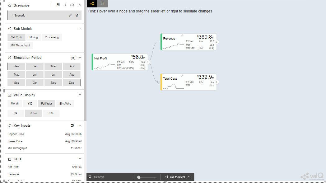
valQ Screen
The left panel is the navigation panel and on the canvas you will find the value driver tree. By default, the tree is open on collapsed mode at a level defined by the designer. This is typically completely collapsed.
As part of the New Release, you will be able to hide the Navigation Panel in the Runtime by clicking the Collapse button as shown in the below Figure.
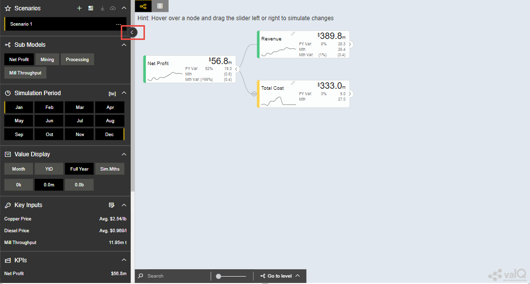
Hiding Navigation Panel in Runtime
As part of the New Release, you can also switch over from Table View Mode to Tree View Mode and vice versa using the button as shown in the below Figure.
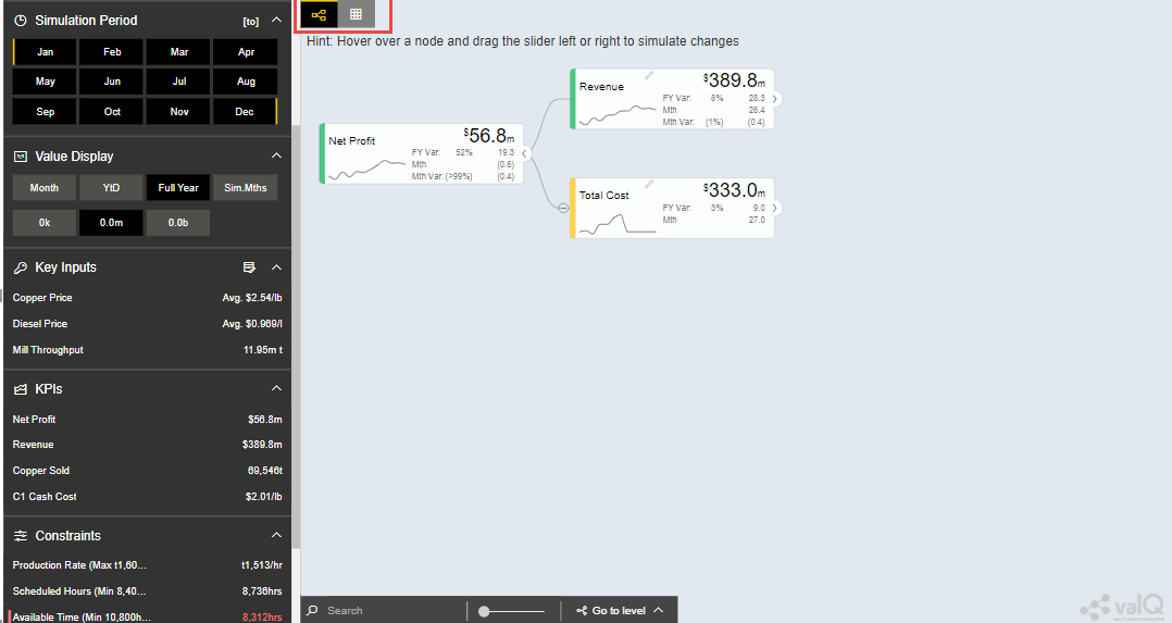
Table/Tree View Mode
Input Data
The valQ Custom Visual works with two input data series – the primary and the comparison data series. A common way of using this is to compare Forecast vs Budget, Budget vs Last Year Actuals etc. The data series is at a certain time grain. This would typically be 1 year by 12 months or a multiyear view like 5 years plan by year.
The selecting of the time series will often be based on Filters or Variables. A typical scenario is where the designer has defined 4 variables on the underlying data sources:
Primary:
Version: ie. Defaulted to Forecast
Year: ie. Defaulted to Current Year
Comparison:
Version ie. Defaulted to Budget
Year ie. Defaulted to Current Year
This allows the users to compare different versions and years in the value driver tree model.
The valQ Custom Visual can display individual periods but can also apply time aggregation such as Full Year, Year-to-Date. You can see the currently selected Value Display aggregation on the Navigation Panel. In the screenshot above, Full Year is selected. The primary value displayed on the Widgets is therefore in this instance the Full Year aggregated data.
Tree Drill Down
Nodes that has children will have an expand ‘>’ button to the right of the Widget as highlighted below:
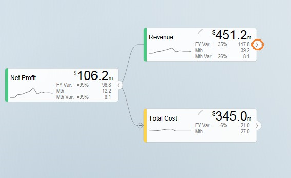
Nodes with children
You can drill down the tree by clicking the expand button.
The tree will focus on the branches that are being expanded. You can collapse any specific node by clicking the ‘<’ collapse button on the right of a widget.
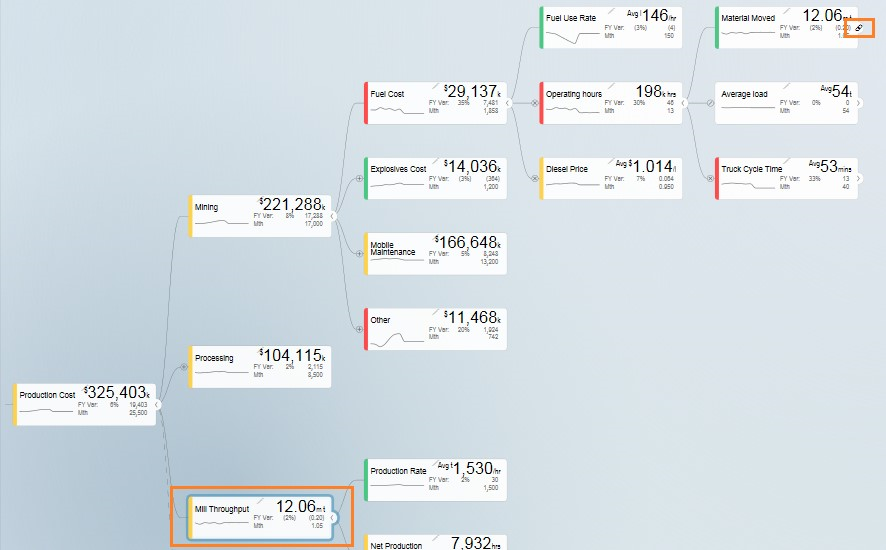
Value Driver Trees are in reality networks. The same driver may impact
multiple aspects of the Tree. The component therefore contains a concept
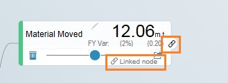
of linked nodes. Such nodes have a link  icon that you can click
which will jump to where the linked node is defined and highlight the
node:
Link
Linked Nodes
To collapse all nodes, click on the collapse icon on the bottom left of
the canvas 
Zoom and Pan
Value Driver Trees can be large. You can zoom and pan the canvas view. If you are using an iPad or iPhone, you can zoom by pinching and pan by dragging the same way you would navigate a map.
If you are using a mouse with a scroll wheel, you can point your curser anywhere in the canvas and scroll the wheel to zoom in and out.
To pan, click and hold the left bottom of the mouse and drag the tree around.
You can also use the zoom button to zoom if your device doesn’t support
other options 
Expand/Collapse of Tree View
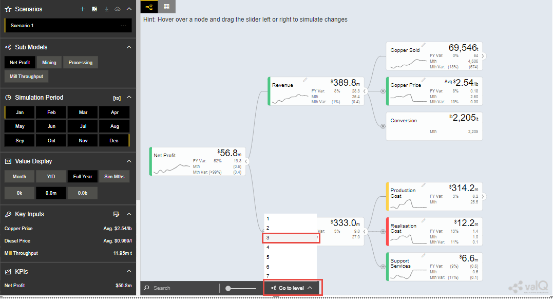
As part of the New Release, you will be able to expand/collapse the Node Hierarchy at the required level using the Go To Level button (see Figure below).
Expand/collapse one level
For our example, the Node Hierarchy level has been selected as third level.
Value Display and Simulation Period
Value Display
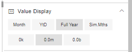
With the ‘Value Display’ functionality you can choose the time aggregation you want to display as the primary value. The designer can link certain nodes to a user selected scaling. You can select the scale you wish to display by selecting this under the Value Display section. Note that the options here can be configured so they may differ. It is important to note that not all notes are scaled using this as the value driver tree typically contains both amounts, prices, rates and physical volumes.
In addition to the primary display value, the designer can also choose a secondary value to be displayed. I.e. if you are showing Full Year as primary, in the below example, it has been configured to visualize the Month data as secondary:
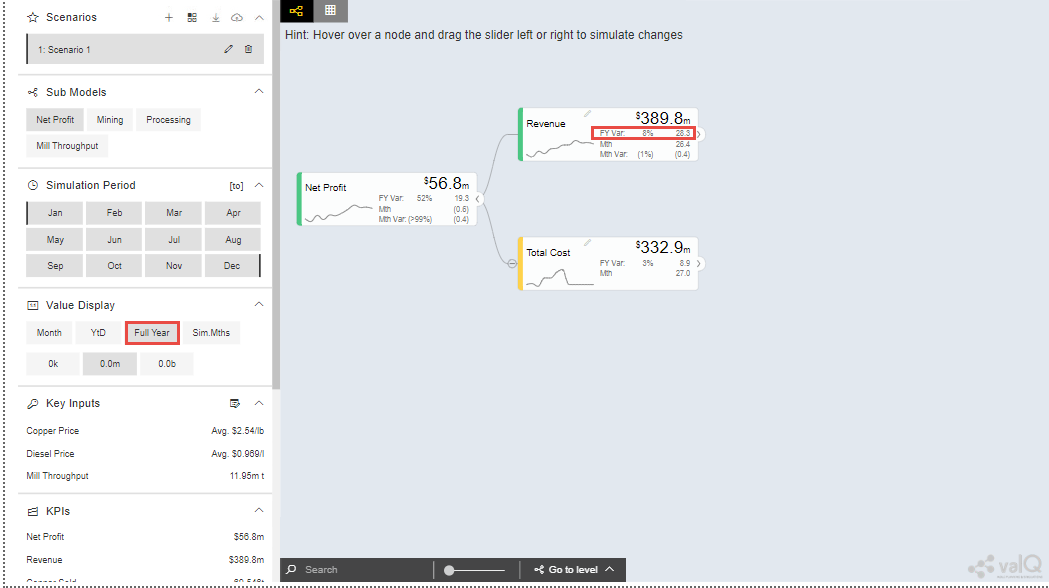
Value Display
The time aggregation and display relates to the Simulation Period selected.
When Month is selected, it shows the first month of the simulation
interval selected. By default, the simulation period is the selected
period and the future. This is an important concept as when we simulate,
we generally don’t want to apply a change to the past as we can’t change
it. It is possible to also set the ‘to’ period in a simulation, just
click  and highlight the month you want as the end period of a
simulation. This is however a special scenario.
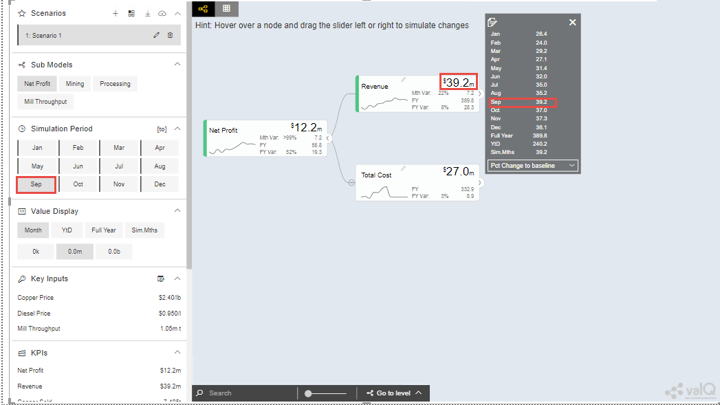
Simulation Period
YTD – the selected period -1 is the year to date data (eg. selected simulation period is September to December, the YTD data will be from Jan to August).
Note: Simulation of future periods will not impact the YTD data.
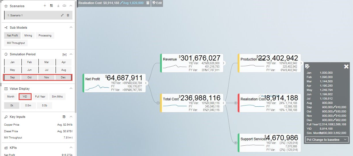
Value Display and Simulation Period
Full Year – Shows the full year cumulated data
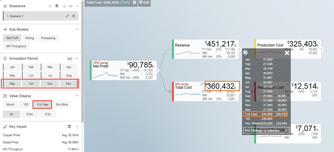
Value Display and Simulation Period
Sim. Period – to simulate a specific period, for example a 3 month
rolling forecast from September to November, click the first month
September then click  and click the last month November for
simulation. You can then choose to only show the values aggregated for
the selected simulation periods
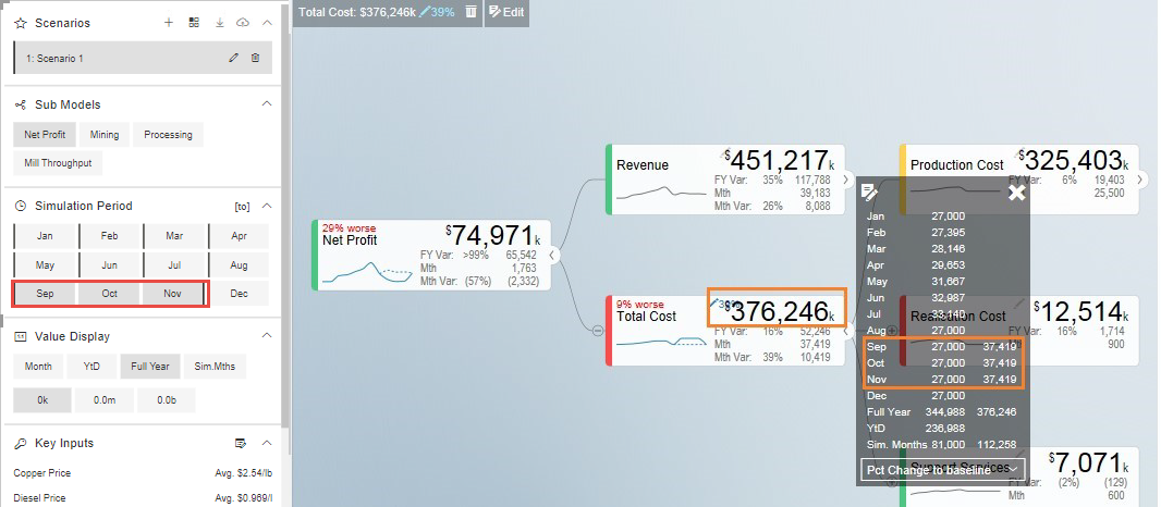
Value Display and Simulation Period
As part of the New Release, you will be able to view the Tooltip for all the Value Displays. For our example, the Tooltip for the Month Value Display is shown in the below Figure.
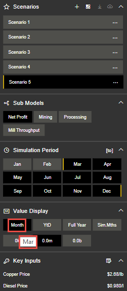
Tooltip for Month Value Display
Similarly you can view the Tooltip for other Value Displays.
Sub Models - Filters
If your Value Driver Tree is large, the designer may have defined specific sub views. These would be listed under the Sub Models Section of the Navigation Panel. When clicking on one of these views, the tree will be filtered and the specific node will be made the top node. Calculation dependencies are still respected but this significantly improves the navigation as it focuses the tree on a specific area.
In this example, the options defined are:
Open all company level: Net Profit
Open per department: Mining, Processing or the operational tree for Mill Throughput

Sub Models – Filters
KPIs
The Navigation Panel can be configured to list a set of KPI’s from the value driver tree. You are able to navigate to each of them for a fast view on the simulation impact on a given KPI. Click on the KPI to navigate to the node.

KPIs
Data Simulation
There are 2 options to simulate:
Hover over a desired node to simulate, slide the scaling button to right for positive impact or left for negative impact. The simulation will be showed on the right hand side. A window will open displaying the changes. The pencil icon will display the change in percentage that has been made:
 , and a legend with percentage showing
if the adjust has made the scenario better or worse
  .
.
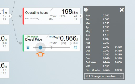
Data Simulation
Click on the arrow icon of the node
 then click ‘Edit Key
Input’
  and manually edit the changes in simulation per
period. Click X to close manual input table.
Notes
You can update the periods highlighted in YELLOW based on the selected simulation period.

Simulation Periods
The edit icon will indicate the months that have been edited.

Simulation Periods
You can update the ‘Variation’ column which will overwrite the numbers in the selected simulation periods. Any manual updates in period will not be overwritten by the ‘Variation’ column. In the example below, in blue are the months which were manually edited and in orange are highlighted the variation and in this case the month to which the variation was applied.

Simulation Periods
Click reset icon to return to the original data  .
.
As part of the New Release, you can simulate the Node having “0” as the value. When the slider is moved to the right end, it will show positive values and when the slider is moved to the left end, it will show negative values. The property of the Simulation remains the same for the Change Percentage, Manual, Growth Percentage and Constant options.
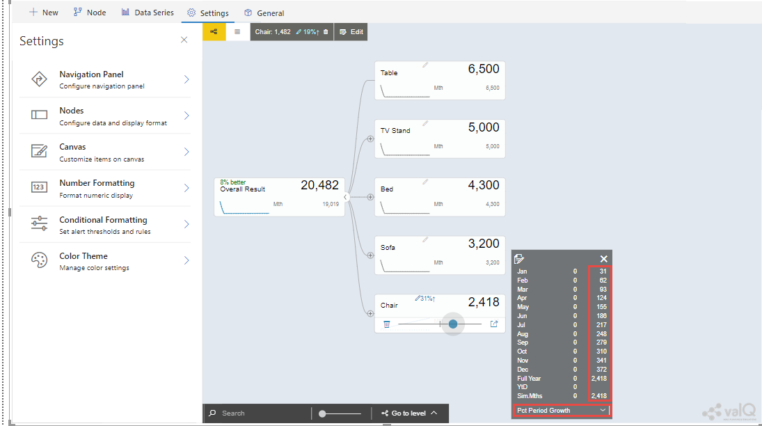
Simulated Node having “0” as values
From the above Figure, you can observe that the Growth Percentage has been selected as an option.
Key Inputs
Key Inputs is available on the left side panel to directly simulate key cost drivers without going into the node details.
Click the ‘Edit Key Input’ icon  and manually edit the changes
in simulation per periods.
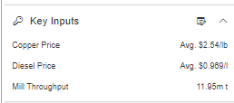
Key Inputs
Notes:
Can update the periods highlighted in YELLOW based on the selected simulation period. All the changes in the Key Assumptions are highlighted in the left side panel side.

Simulation Periods
Click X to close manual input table.
Click a Key Assumption or Key Performance Indicator and it will highlight the source nodes to further check the details.
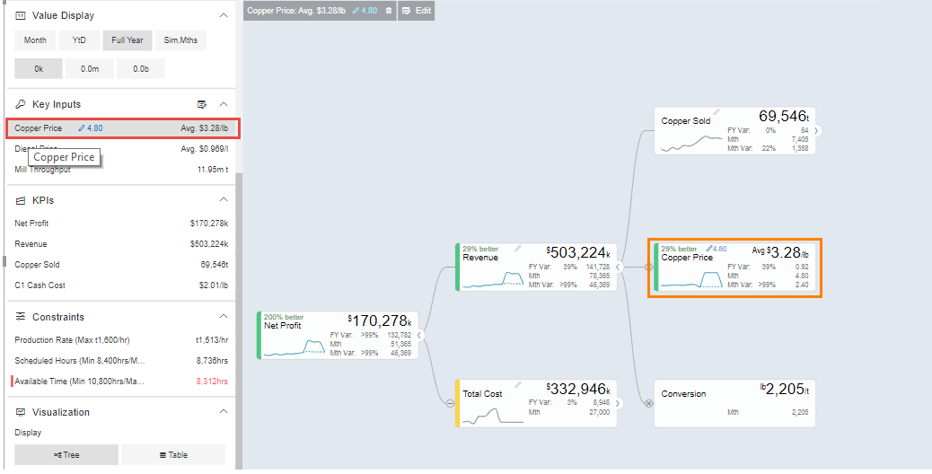
Key Inputs
All simulations are highlighted in the upper right corner.
Click  to return to the original selected version without any
simulation.
When more number of simulations are done, you will be able to view the More button in the upper right corner. By clicking the More button, you will be able to see the remaining simulations as shown in the below Figure.
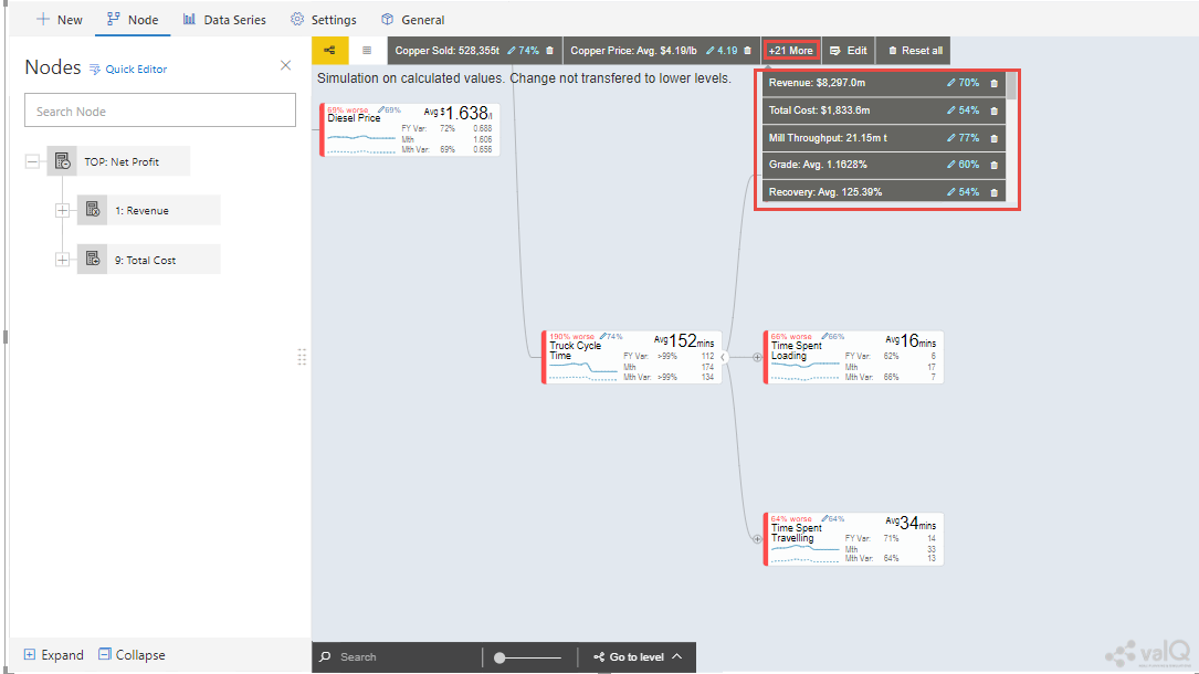
Simulations - More option button
Scenarios Functionality
You can create multiple scenarios in parallel, compare them as well as sharing the collection with others.
This is how you do it.
Create a Scenario 1 by clicking the “+” button in the Navigation Panel (see Figure below).
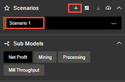
Create Scenario
You can view the Context Drop Down Menu as shown in the below Figure.
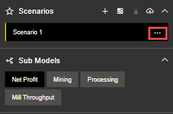
Context Drop Down Menu
After clicking the Context Drop Down Menu, you will be able to view the Menu items such as Copy Scenario, Edit and Delete Functions (see Figure below).
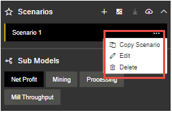
Context Drop Down Menu Items
When you click the “Copy Scenario” Menu Item, you will be able to create the Scenario 2 with the same configuration as done for Scenario 1.
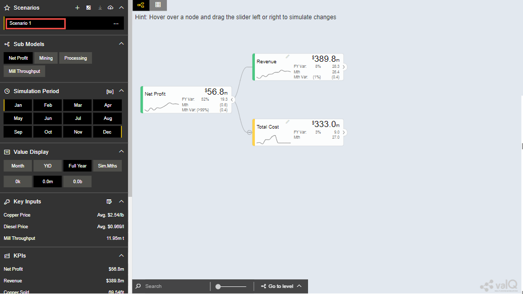
Scenario 1
The above Figure shows the settings for Scenario 1. When you click the “Copy Scenario” Menu Item, you will be able to view the Scenario 2 being created with the same set of configuration done for Scenario 1 (see Figure below).
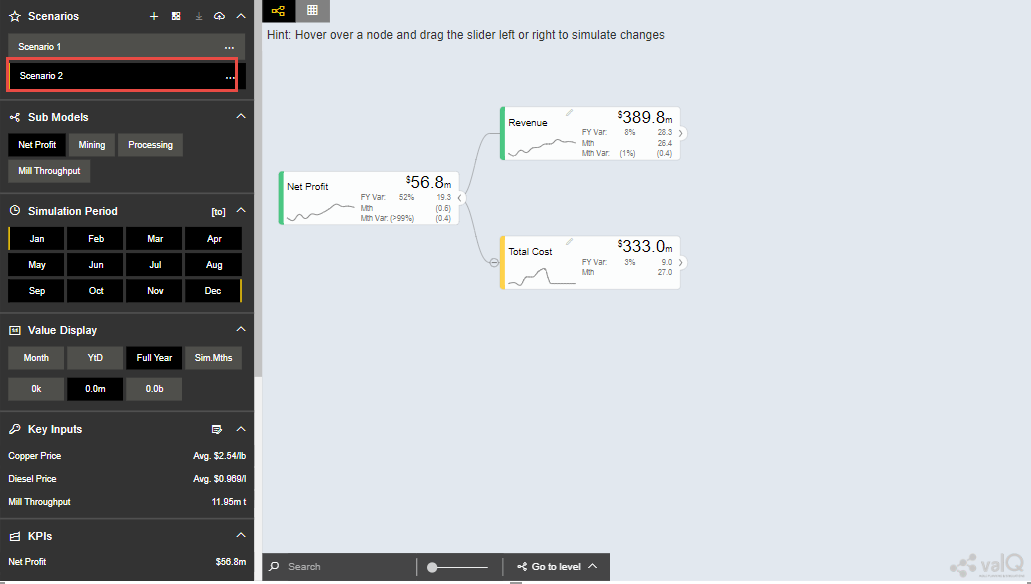
Scenario 2
The copied scenario is the replicate of the last scenario (e.g. Scenario 2 will have the same data from the copied Scenario 1.
By clicking the “Edit” Menu Item, you will be able to edit the Scenario (see Figure below).
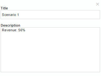
Scenario 1 Edit
From the above Figure, you can observe that you will be able to edit the labels for the Title and Description for the selected Scenario.
By clicking the “Delete” Menu Item, you will be able to delete the entire Scenario.
Click ‘Create a new Scenario and make it the active scenario’ icon as shown below

Create a new Scenario and make it the active scenario icon
This will create a new Scenario and will highlight the created Scenario as the active scenario.
Click ‘Compare Scenario’ icon to generate a report comparison format with the key Assumptions and KPI’s (see Figure below).

Compare Scenario icon
Comparison report compares all scenarios that have been created in the active collection. It also shows the Simulated Data Scenario (Baseline: Full Year), Comparison Version (Full Year) and Simulated Data Scenario Year to Date (Baseline: YTD).
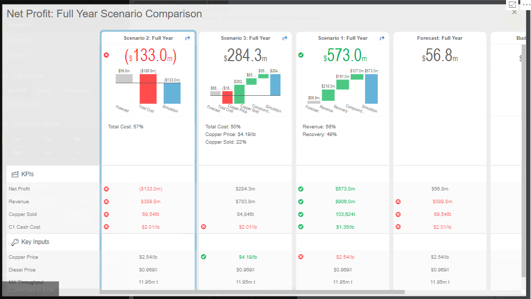
From the below Figure, the GREEN fonts denotes the most favorable results and the RED fonts denotes the least favorable result in the scenario comparison report.
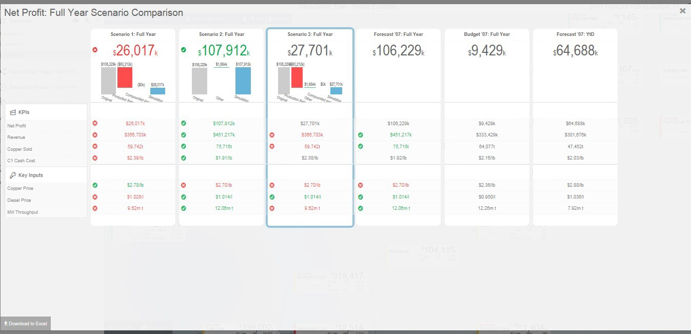
Full Year Scenario Comparison
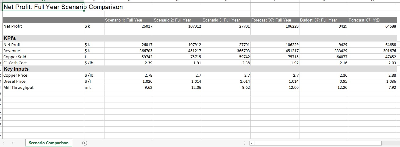
Full Year Scenario Comparison
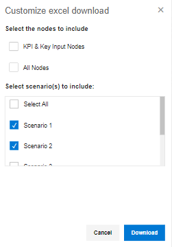
As part of the New Release, you will be able to download the excel file of the compared scenarios based on your choice by clicking the “Download to Excel” option in the Scenario Comparison screen as shown below.
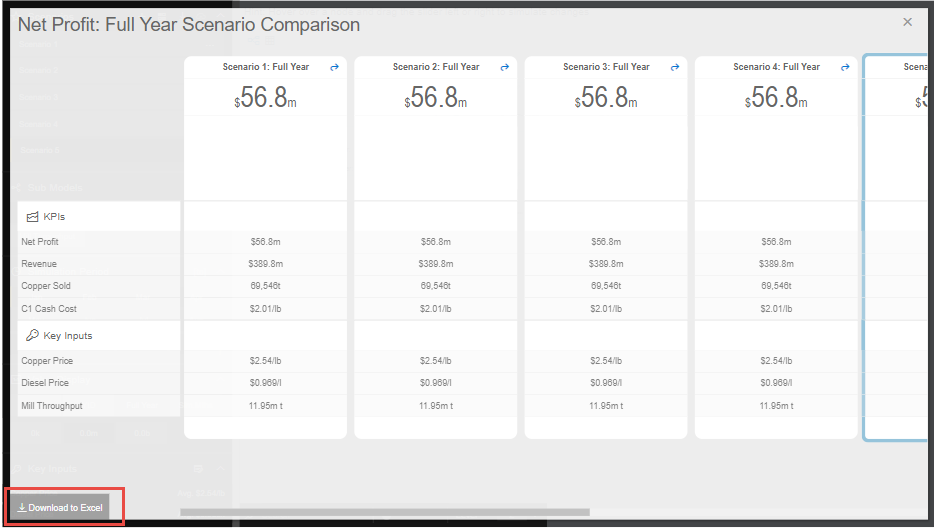
Download option in Scenario Comparison screen
You can select the Scenario and download the excel file as shown in the below Figure.
Scenario selection
You have the option to make additional simulation in the new scenario or click the icon appearing in the top most right pane to return to the original selected version without any simulation and then make a new simulation (see Figure below).

Reset All icon
Click the Download icon located in the Scenarios Section to extract the report in xml format (see Figure below).

Download icon
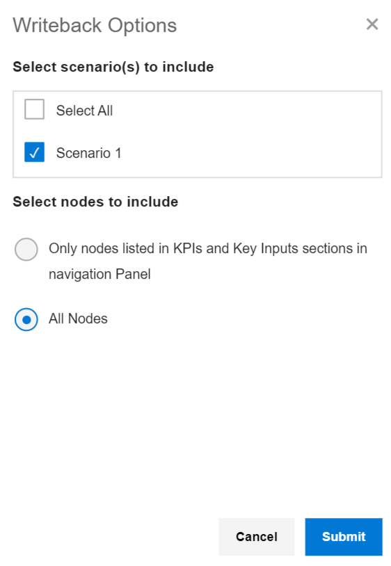
Click the icon for write back functionality (see Figure below). By clicking this option you will be able to write back/post valQ data to a configured URL in the server.

Write back icon
By clicking the Configure URL to write back the current scenario option, you will be able to select any one among the two different options to write back the current scenario to the configured URL in the server (see Figure below).
Write back options
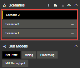
The created Scenarios can be reordered based on our choice by a simple drag and drop options. For our example, you have reordered the Scenarios as shown in the below Figure.
Reordered Scenarios
Based on the reordered scenarios, you will be able to view the Comparison Report with the similar reordered hierarchy as shown in the below Figure.
Comparison Report with reordered Scenarios
Constraints
Constraints are also available in the left side panel that identifies the metrics that are overcapacity (highlighted in RED fonts) or still have opportunities for further improvements (WHITE fonts).
Notes:
RED fonts means over capacity as compared to the maximum limit. (e.g. Production Rate 1.680 tonnes per hour is over capacity as compared to the maximum limit of 1.600 tonnes per hour).
WHITE fonts means still have opportunities for improvement as compared to the maximum limit.

Constraints
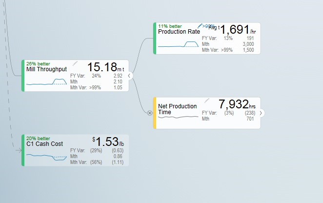
Constraints
Visualization
Visualization is available in the left side Navigation panel which helps the users view the Tree in the Table or Tree format based on their choice. By using the View Mode, the user can select three different view modes namely Full, Standard and Minimal to view the Tree or Table Format.
The below Figure represents the Tree View Format with the View Mode being selected as “Full”. Here you can observe that the Nodes will be displayed in Full mode.
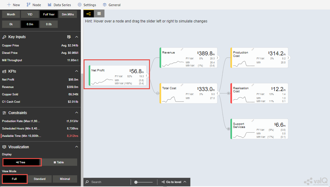
Visualization - Display as Tree and View Mode selected as Full
The below Figure represents the Table View Format with the View Mode being selected as “Standard”. Here you can observe that the Table view will show the Primary value, Comparison value, Variance and Variance % values for the Full Year.
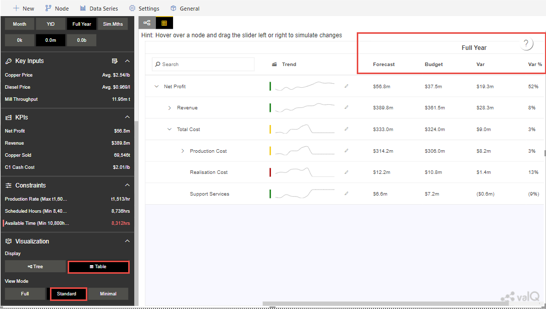
Visualization - Display as Table and View Mode selected as Standard
When the View Mode is selected as “Full”, then you will be able to view the Table with Primary value, Comparison value, Variance and Variance % values for the Full Year and also the same set of values for the Month.
When the View Mode is selected as “Minimal”, then you will be able to view only the Primary value and Comparison value for the Full Year.
Contextual Help Information
As part of the New Release, the Contextual Help Information feature has been included in the Advance Editor window by which the user can be directed to the specific help page. For our example, navigate to the Settings Tab and click the Navigation Panel. You can view the Contextual Help Information icon (see Figure below).
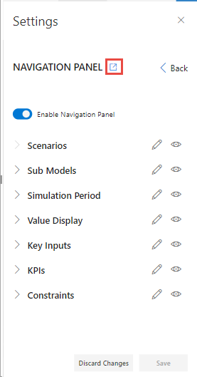
Icon for Contextual Help Information
By clicking the Contextual Help Information icon, you will be redirected to the Help Information page for the Navigation Panel.
Understanding Variances
The starting point for a simulation is a selection of two versions - Primary Version and a Comparison Version and a year. For instance a forecast vs current budget.
Once we start simulating, changes are applied to the primary version. We call this changing version the Simulation.
To understand the improvements we achieve, we also keep track of the original values from the primary version without simulation changes. We therefore have 3 data series in the model that we calculate and compare:
Simulation (The Primary Version including applied variations)
Original (The Primary Version without variations)
Target (The Comparison Version)
Based on the above, we calculate the following variances:
Simulated Variance (Simulation vs Target)
Q: If we changed these things, would we hit target?
Simulation Impact (Simulation vs Original)
Q: How much would we improve if we made these changes?
Original Variance (Original vs. Target)
Q: What was our variance if we did nothing?
Understanding the Node Widget Information
The Node Widget for a Value Driver displays key information such as value, variance, simulation impacts and trend without having to navigate further.
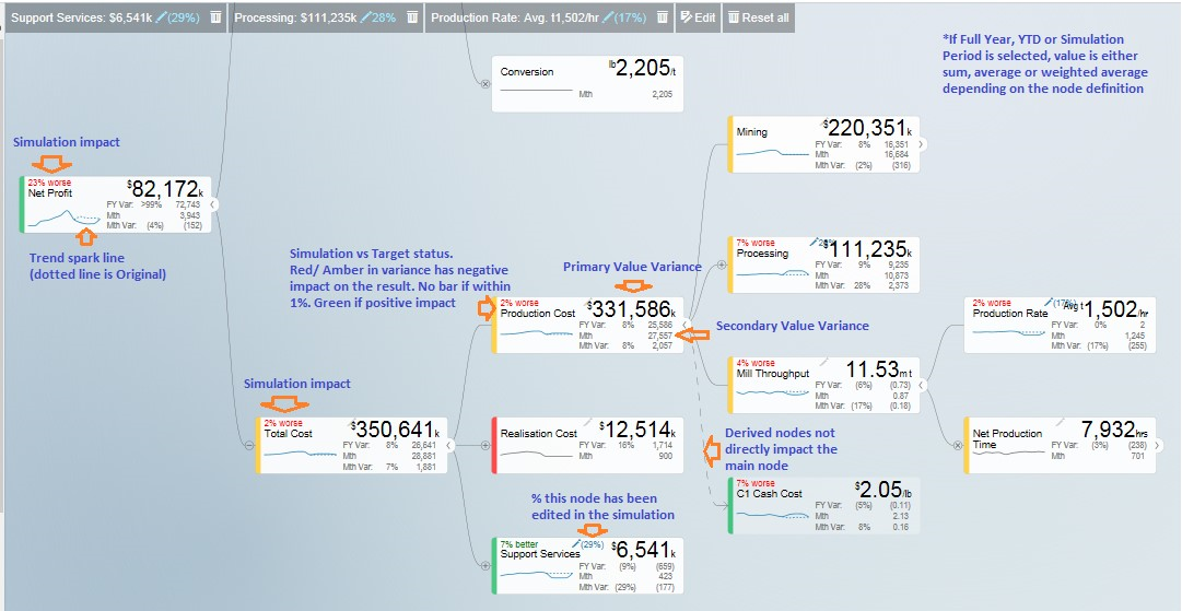
Node Widget Information
Conducting what-if analysis
One of the main aspects of the valQ Custom Visual is to be able to simulate the impacts changes to key drivers such as prices have on the full year forecast. As we can’t change the past, such a simulated change should only be applied to future period. The valQ Custom Visual have this capability. When performing what-if analysis, the period that a simulation should be applied from is selected in the Side Panel (current period is default):
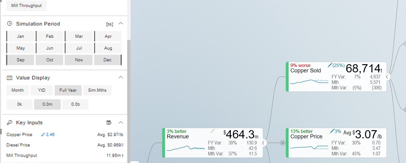
What-if-Analysis
Assuming that we calculate fuel cost based on litre per month and price as $/l and we are at the end of period 9, the simulated cost should be calculated first at the monthly level with the % change applied to period 9 and onwards. Once the individual months are calculated, they can then be aggregated based on the rule of the node (sum for diesel cost, weighted average for diesel price):

When hovering over a node, the bottom half of the node becomes a slider. Drag the slider left to vary the node by a negatively, drag right for positive. As you drag, the values for the selected node is dynamically recalculated and displayed. When releasing, the tree will immediately recalculate all dependent nodes and show the result.
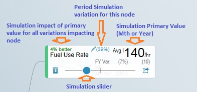
Simulation
A simulation change is either a pct. Change, a fixed future price or a pct. Growth depending on the simulation model defined for the value driver.
The default method for the driver can be seen on the simulation tooltip. You can also change the selected model by selecting at the bottom of the tooltip.
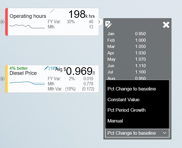
Simulation Tooltip
Understanding that a change is applied to the selected periods only is particularly important to understand when displaying the Full Year value and the node is using a weighted average. The displayed value is the weighted average value for the full year, not the value for future periods.
A simplified example will help understanding this critical concept. Let’s assume that the diesel price is $1.014 for all periods and the monthly fuel consumption is constant as well at 1m litres and we have selected period 9 as we want to apply the simulation to the remaining periods of the year.
We now drag the slider for the fuel price to the right and the node will show the new weighted average value. Let’s say we drag it to the right so the full year weighted average is $1.030. As the first 8 periods were $1.014, the weighted average of $1.030 means that the simulated price change is equivalent of a future fuel price of $1.20. To better understand the individual future period simulations when looking a Full Year aggregated number, it is useful to pay attention to the Month Data also shown on the node. The real world is a little more complex as the price is not necessarily the same every month and the fuel consumed is unlikely to be constant as well. Below is an example of such a simulation based on a real data set:

Simulation
The weighted average price was 1.014. We now simulated a 2% increase in the prices selected and future periods which equates to a new weighted average price of 1.030. If you look at the month Value, you can see for the selected month, this equates to the higher price of 1.195.
Multiple variations can be applied in parallel as they are expressed as pct. The top left % indicate the cumulative impact on this particular node of all simulation that impacts it.
Any node with a variation will have the blue pen icon in the top middle showing the percentage the node has been varied with. For quick what-if analysis at any level and a dynamic work process from the general to the specific, you can apply a simulation on any level.
Certain nodes may have been locked from changes in the model. This is
generally when there is a specific reason not to vary this node directly
for consistency purposes. A locked node will not have the grey pen icon
 or a slider when hovering.
Certain nodes may be displayed multiple times in the tree. An example is Material Moved as it affects Mining and Mill Throughput. In these scenarios, one node is linked to the other. If you simulate a change in a linked node, the node it is pointing to is instead changed so it applies both to the selected node and anywhere else where the driver is used. If a node is a linked node, it has the Linked node text in the bottom right corner:

Simulation
Getting more information about a Value driver
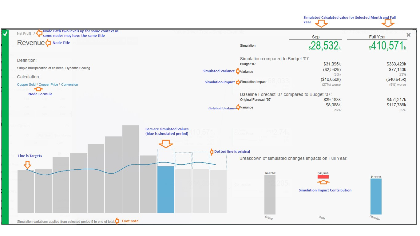
If you click on a node Widget, a Pop up screen is displayed with additional information on the selected node.
Information on Value Driver
For some nodes, the designer may have added a description beyond the title. If so, this will be displayed below the title.
If a node is calculated, a simplified version of the formula is displayed. This is the technical formula that is used to calculate individual period values. To calculate the real values, all simulation variations that affects the node are applied to selected and future periods and the aggregation rules for the node is applied (sum or weighted average).
The trend chart compares the simulated value to the comparison version as well as showing the original value as the dotted line on the bar if simulation variations are active. If you hover over the bar, you will the see the details for the period.
The table on the top right shows the period and full year values and the variance calculations as per the definition previously in this document.
The valQ Custom Visual also analyses all the active simulations to see if any impacts this particular node. If so, it then analyses how much each of the active simulation changes contributes to the overall impact on this node and generates a waterfall diagram with the break down which is displayed in the bottom right panel.
In some scenarios, you may vary multiple factors impacting the same node in a compound nature. I.e. you vary both sales volume and sales price and want to know the impact on revenue. As the sum of both changes is more than the impact of each individually, the waterfall chart breaks down each of the individual impacts and a compound impact bar.
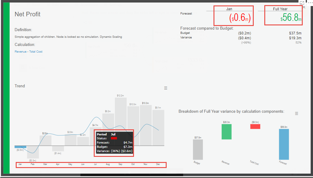
As part of the latest Release, you will be able to view the Value Display Tooltip by hovering the mouse over the Trend Chart Area in the Pop up screen (see Figure below). Also you can view the data labels for the X Axis. The values representing the loss status will be in Red color and the values representing the gain status will be in Green color as shown in the below Figure.
Pop up screen Display
For more details on Pop up screen, you can refer the link: https://valq.com/blogs/video-valq-pop-up-screen-nodes
Saving and Opening Scenarios
The standard valQ Custom Visual template contains functionality for saving and opening a scenario collection.
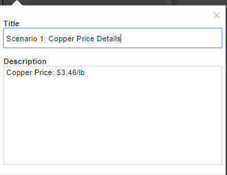
When clicking the Edit button  , you will be asked to provide a
Scenario Title Name.
Scenario Title Name
You will be also able to delete the existing scenario from there using
the Delete button  .
.
There is also an option to export the value driver tree data set to xml. It will create an unformatted spreadsheet with the tree and all the node data.
