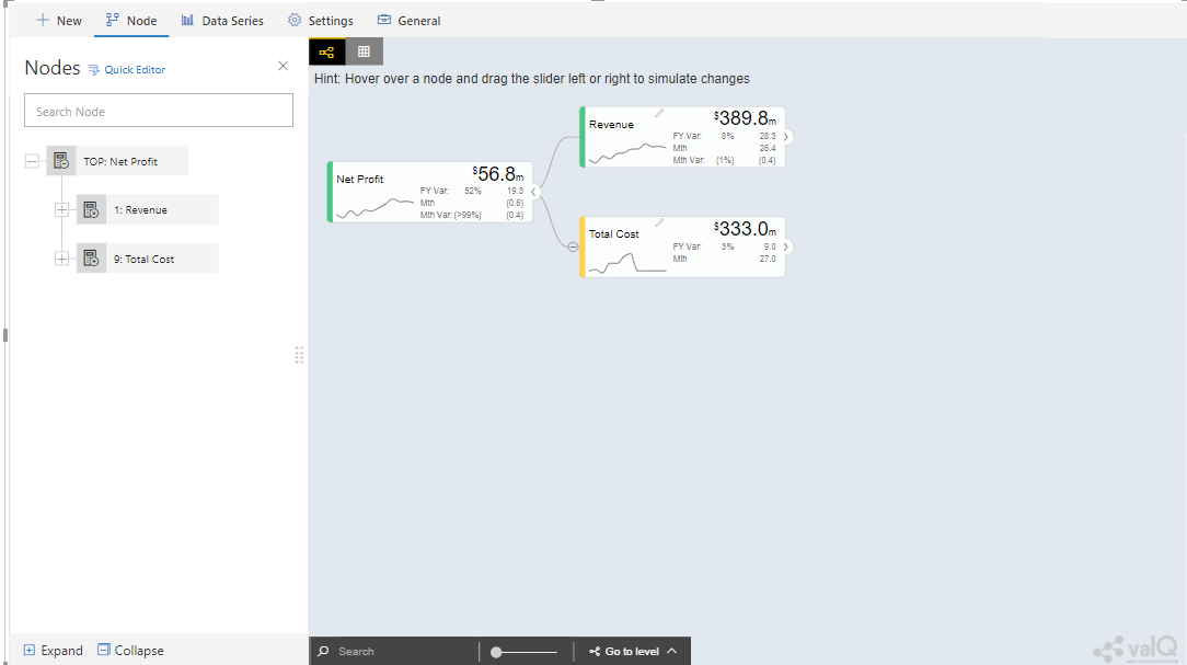
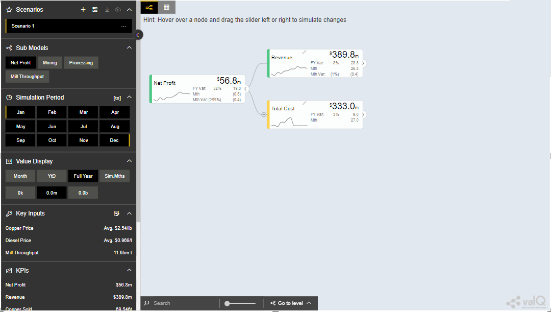
Model Tab
The Model tab has two panels in which the left panel represents the Advanced Editor and the right panel denotes the canvas which represents the Value Driver Tree visuals (see Figure below).
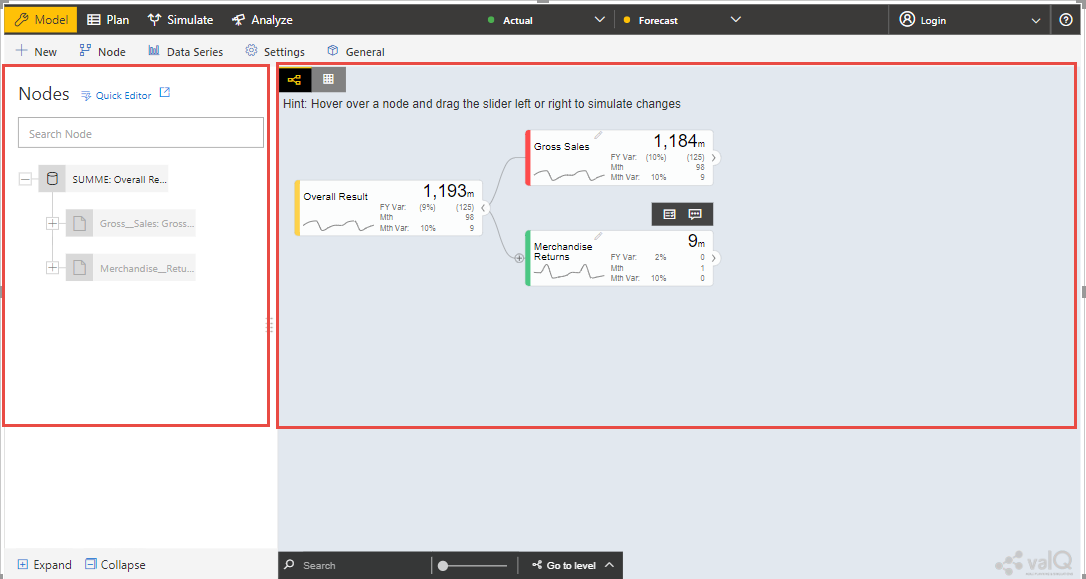
Left Panel and Right Canvas
The Model tab has five different Tab options (see Figure below).

Tab option for the Model tab
The Tab options for the Model tab has been listed below:
New Tab – To configure the design for the Value Driver Tree using the options such as Sample Demo Tree, Create a Simple Dynamic Tree, Import an Advanced Tree and Create a New value driver tree from the scratch.
Node Tab – To configure the settings of Nodes and Child Nodes for the Value Driver Tree
Data Series Tab – To configure the data settings such as Data Series Manager, Time Aggregation Labels and Data Sorting.
Settings Tab – To configure the settings parameters such as Navigational Panel, Nodes, Canvas, Number Formatting, Conditional Formatting and Color Theme.
General Tab – To configure the General settings such as License Registration, Export and Writeback functions.
In the next sections, you will be able to understand on how to design a value driver tree using these five different Tab categories in detail.
As an initial step, follow the below steps to configure the design for the value driver tree in Power BI.
Navigate to the “Visualizations Panel” and “Fields” Panel in Power BI (see Figure below).
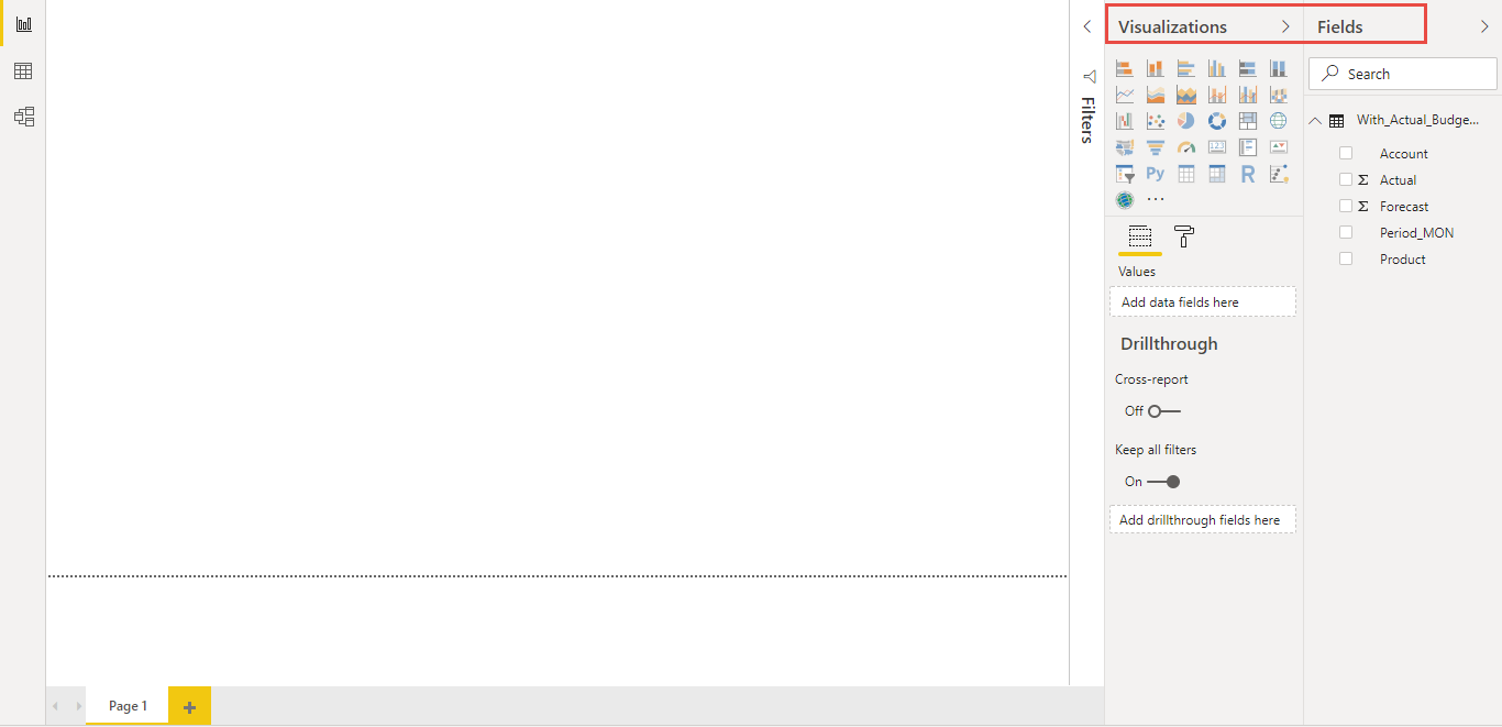
Power BI with Visualizations and Fields Panel
In the Visualizations Panel, select the valQ Custom Visual and extend the screen to its full view as shown in the Figure below.
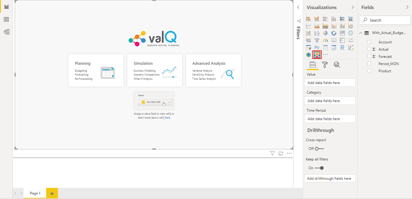
valQ Screen - Measures to be assigned
To create a value driver tree (valQ) in Power BI, it is mandatory to assign a Data Source to the value driver tree. For our example, a data source (sample data shown below) has been assigned to the value driver tree.
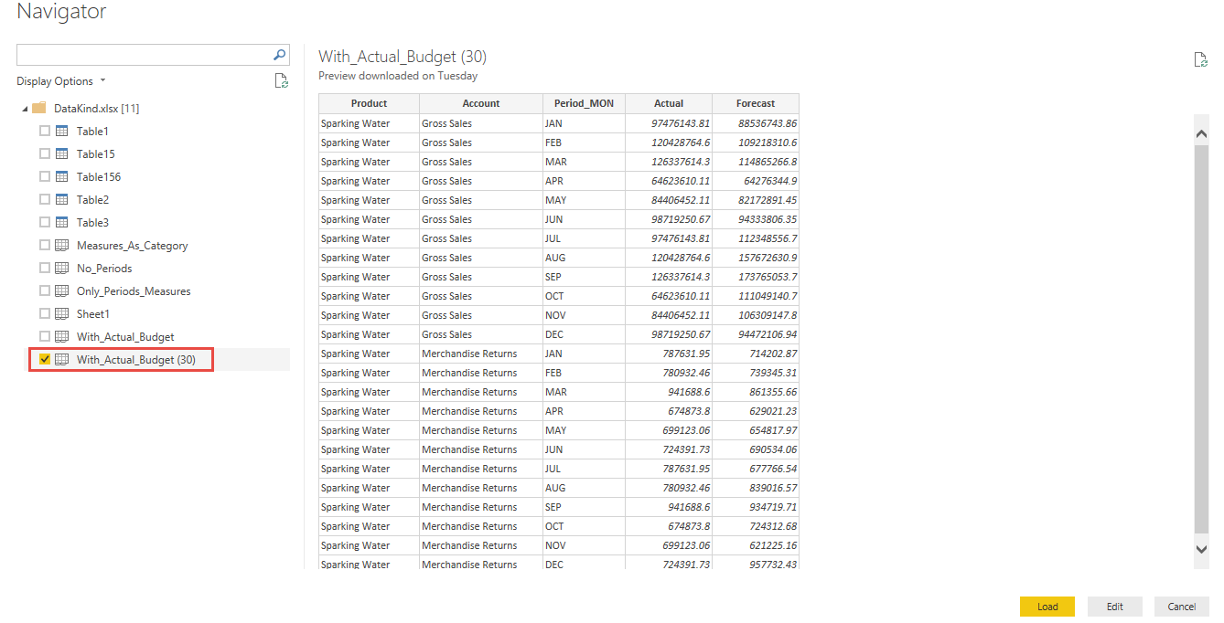
Sample Data
Now at least one Measure Value has to be assigned to the property “Values” in Visualizations panel. In our example, we have assigned the Measure Value “∑ Actual” to the property “Values” by clicking the check box option against the Measure Value “∑ Actual” (see Figure below).
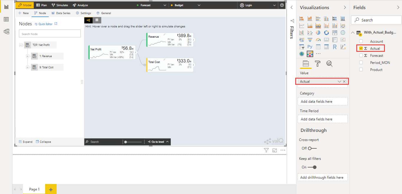
Assigning the Measure Value
New Tab
The Value Driver Tree can be created in Power BI using the below listed options by clicking the New Tab in the left panel (see Figure below)
Open a Sample Model
Create a Simple Model
Create an Advanced Model
Import an Advanced Model
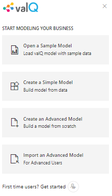
New Tab
Open a Sample Model
Click the “New” Tab in the left panel. Now navigate to the Open a Sample Model option. You will be able to explore a Demo Tree. By clicking the Open a Sample Model option, you will be able to view the Loading sample screen as shown below and also you can search for the specific sample to get loaded (see Figure below).
Loading screen
For our example, the sample “Mining Industry” has been selected.
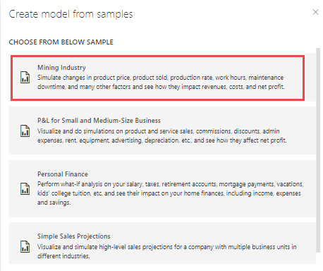
Selection of sample model
Based on the selection, you will be able to view the valQ screen as shown below. As part of the latest Release, each Node in the Advance Editor panel will be having an Icon which represents the Node Type.
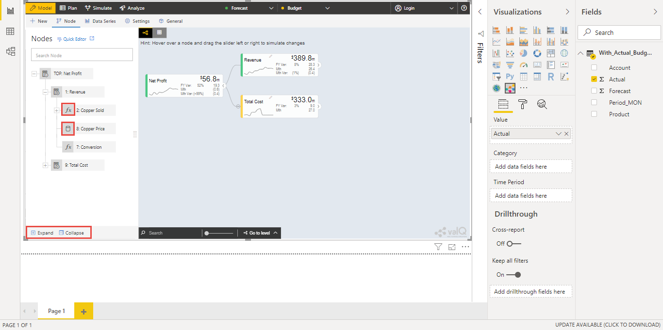
valQ screen with Nodes settings
The Nodes hierarchy will be displayed in the Advance Editor option as shown in the above Figure. Here you will be able to add number of child nodes from the parent node “Net Profit”. By clicking the Parent Node, you will be able to add number of child nodes as shown below. Also you will be able to expand, collapse and delete the entire Nodes Hierarchy using the options “Expand”, “Collapse” and “Delete” (see Figure above).
As part of the New Release, the “Lock” and “Unlock” options have been included in the Advance Editor for the Node Tab (see Figure below). By clicking the lock option, you will not be able to edit the configuration done for the Node (see Figure below).
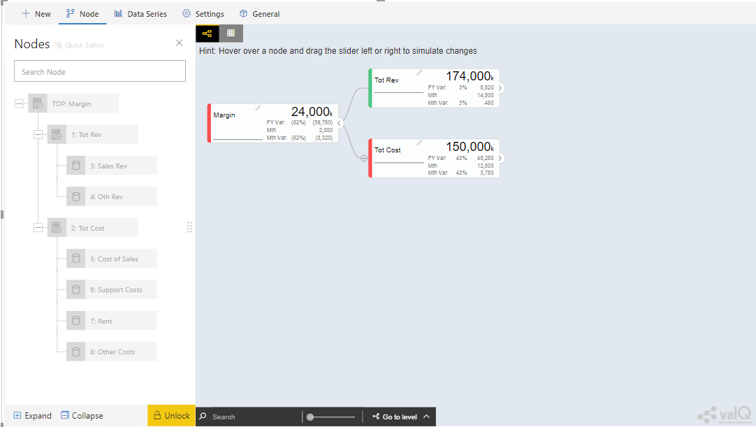
Lock option in Node Tab
By clicking the Unlock option, you will be able to edit the configuration done for the Node (see Figure below).
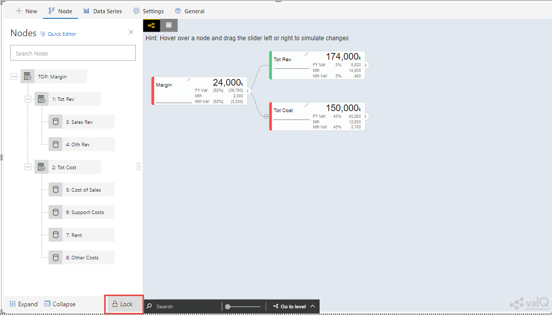
Unlock option in Node Tab
By providing the Node Name in the Search option on the right canvas, you will be able to search for the particular Node when there are more number of nodes appearing on the right canvas.
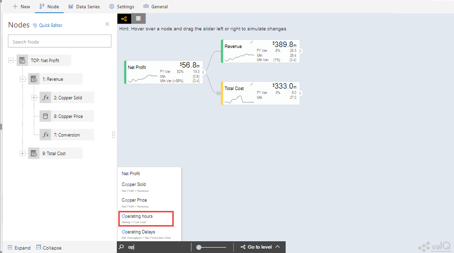
Node Search option in right canvas
For our example, the Node name is given as “Operating Hours” and based on the search you will be able to view the Node as shown in the Figure below.
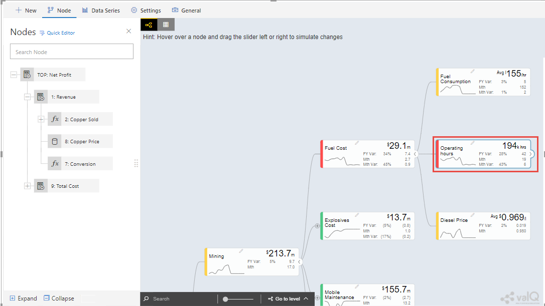
Display of the Searched Node
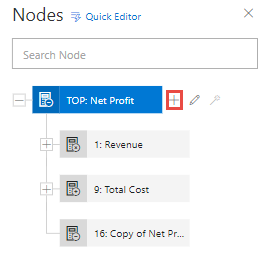
Nodes Structure with Add option
In the above Figure, you can observe that by clicking the “+” button, a Node “Copy of Net Profit” has been added. Similarly you can edit the Parent Node details by clicking the Edit button as shown below. For our example, the Edit button has been clicked.
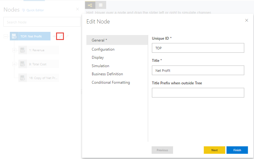
Nodes Structure with Edit option
By clicking the Edit option you will be able to view the Edit Settings for the Node. The Edit Settings are categorized as follows:
General
Configuration
Display
Simulation
Business Definition
Conditional Formatting
Secondary KPI
General
In General settings you will be able to configure the Node details such as Unique ID, Title and the Title Prefix when outside the Tree with the values as shown in the below Figure. The Title Prefix can be set at Node Level and during simulation it is useful to identify at which node the parameter value changes. The additional properties of the Node Tab has been listed in Section 13.2.
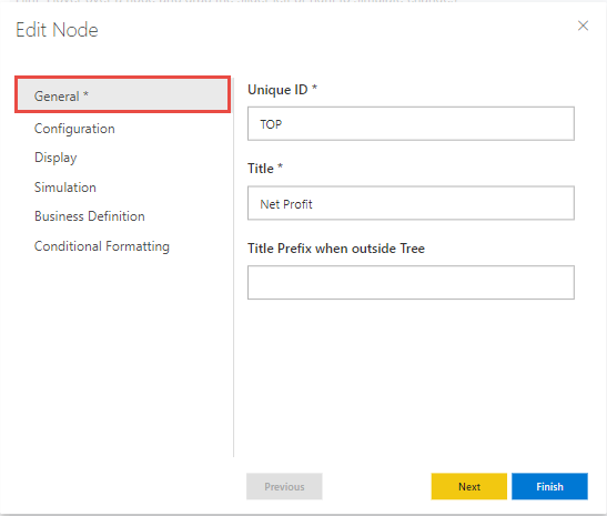
Edit Node – General Settings
Based on the above configuration, you will be able to view the valQ screen as shown below.
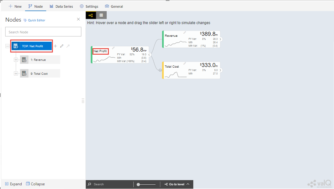
valQ screen with General settings
From the above Figure, you can observe that the Unique ID for the Parent Node is “TOP” and the Title of the Parent Node is “Net Profit”.
In our other example as shown below, we have configured the Title Prefix for two different Nodes (see Figures below).
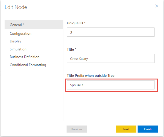
Node with Prefix value as Spouse 1
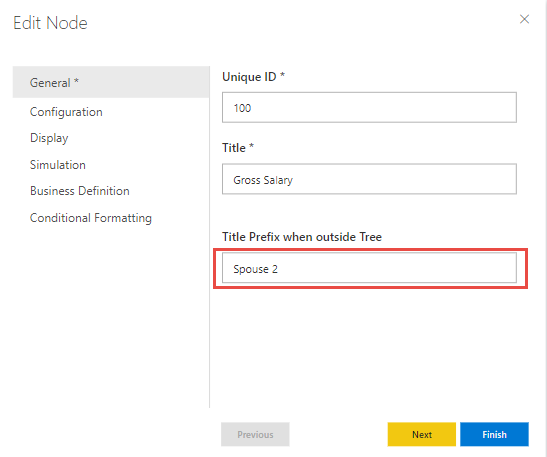
Node with Prefix value as Spouse 2
Based on the above set of configurations, you will be able to view the valQ screens as shown below.
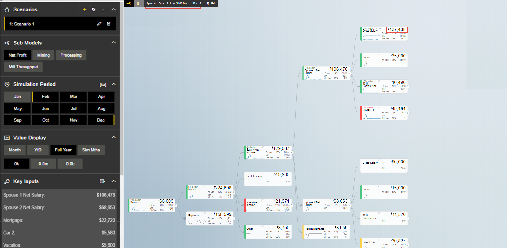
valQ screen with Spouse 1 Prefix
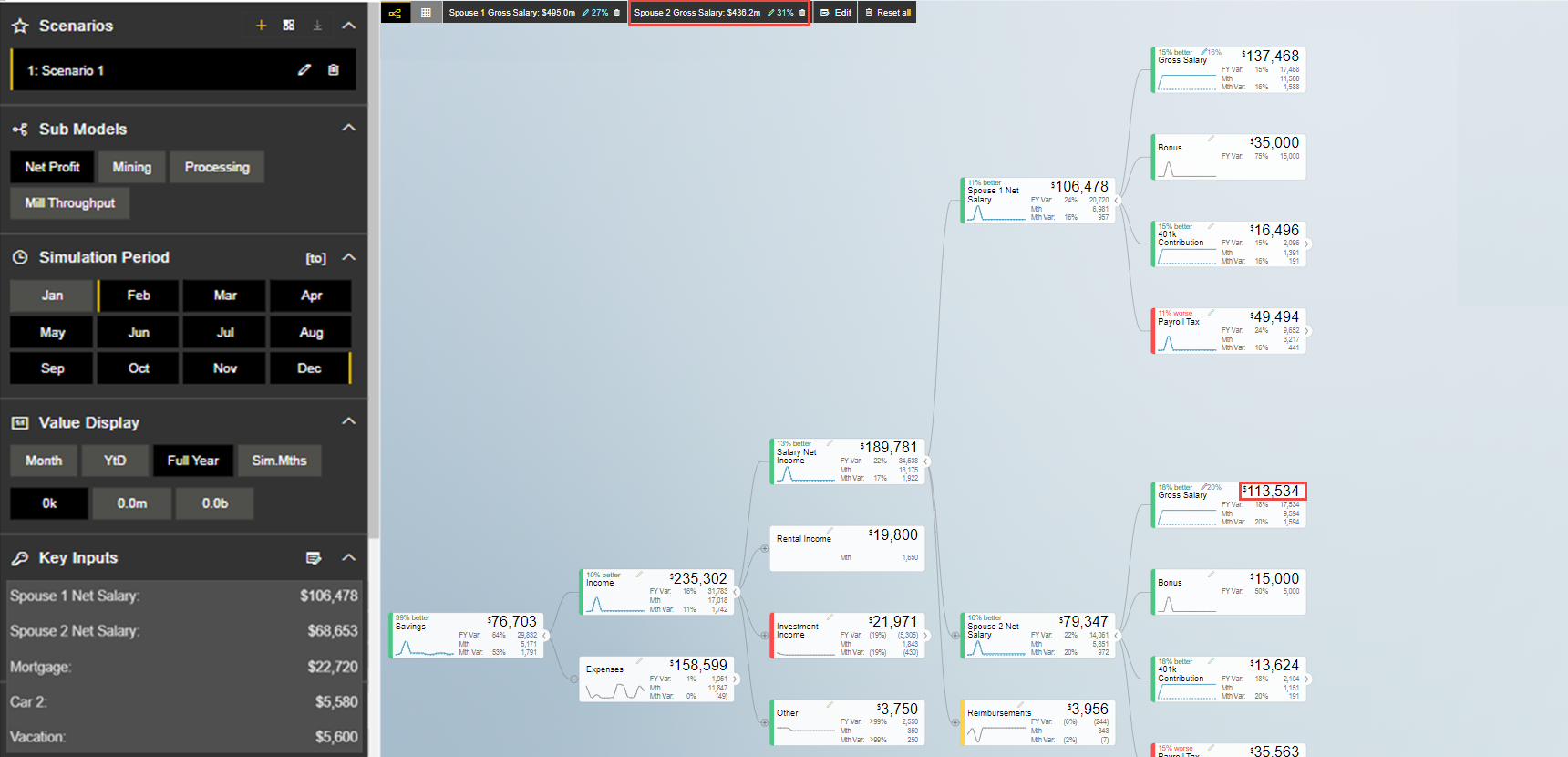
valQ screen with Spouse 2 Prefix
From the above two Figures you can observe that the “Gross Salary” is the common Title for two different Nodes. In order to differentiate them, we have provided the value for “Title Prefix when outside the Tree” as Spouse1 for one Node and Spouse 2 for the other Node. After simulation, you can see which Node’s value has been changed.
Configuration
In Configuration Settings, you will be able to configure the Node details such as Calculation Method, Time Aggregation, Desired Trend and Value Range with the values as shown in the below Figure.
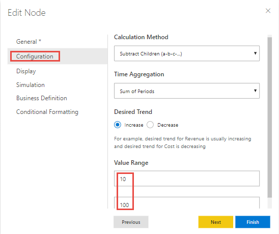
Edit Node – Configuration Settings
Based on the above Configuration settings, you will be able to view the valQ screen as shown in the below Figure.
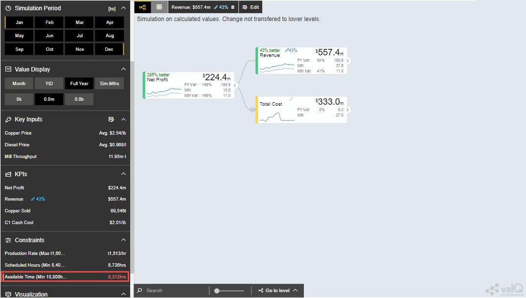
valQ with Configuration settings
From the above Figure you can observe that in the Navigation Panel, the value that is displayed in the Constraints section will lie in the range from minimum 10 to maximum 100 for a specific month based on the configuration done for the Value Range. In our example, the calculation method is selected as ‘Subtract Children (a-b-c)’ meaning that from the first child node the other child nodes will get subtracted and its result will be displayed in the Parent Node. The Time Aggregation is set to Sum of Periods where we have considered 12 months as period. As the result of simulation, each Node will display the values based on the Sum of Periods. Also the “Desired Trend” has been set to the Increase option. When simulated, the desired Trend for the Revenue will be increasing and the value for the Total Cost will be decreasing.
For the Calculation Method being selected as ‘Data Source’, you can follow the steps as explained in the following link : https://valq.com/blogs/3-methods-of-mapping-valq-nodes-to-data/
For other options of calculation method, you can refer the link: https://valq.com/blogs/assigning-values-to-nodes-in-valq/
On selecting ‘Formula’ and clicking on the formula field, you will be able to see a dropdown of the formulas that are supported. For a list of formulas that are available in valQ, you can refer to the link List of Formulas and Functions
Template Nodes
Also you can create a Template Node for the already existing Node. It is very specific that the Template Nodes should not map the Parent Node. You need to select the particular Node and copy a Node under the selected Node for creating the Template Node.
In the below Figure as an example, you can observe that a copy of Revenue Node has been created by the right click copy and paste actions. Now the copied Revenue Node version is labelled as “Revenue 2” in General Property of the Edit Node Window (see Figure below).
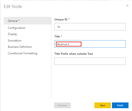
Edit Node: Copy of Revenue Node labelled as Revenue 2
Now navigate to the Configuration property of the Edit Node Window. Set the Calculation Method to the option Template based on the node. Also set the Node to use as Template to the option 1:Revenue (see Figure below).
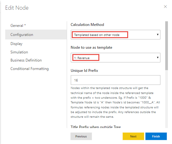
Edit Node: Calculation Method selected as Template based on other node and Revenue Node to be used as Template
Based on the above configuration, you will be able to view the Templated Node Revenue 2 having all its Nodes similar to the Revenue Node as per our example.
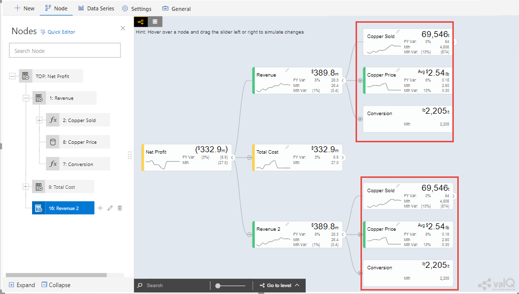
Templated Node
Display
In the Display Settings, you will be able to configure the Node Display settings such as Node Display, Scale, Value Decimal Places, Value Prefix, Value Suffix and Details on Click with the values as shown in the below Figure.
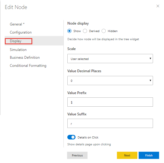
Edit Node – Display Settings
Based on the above Display settings, you will be able to view the valQ screen as shown in the below Figure.
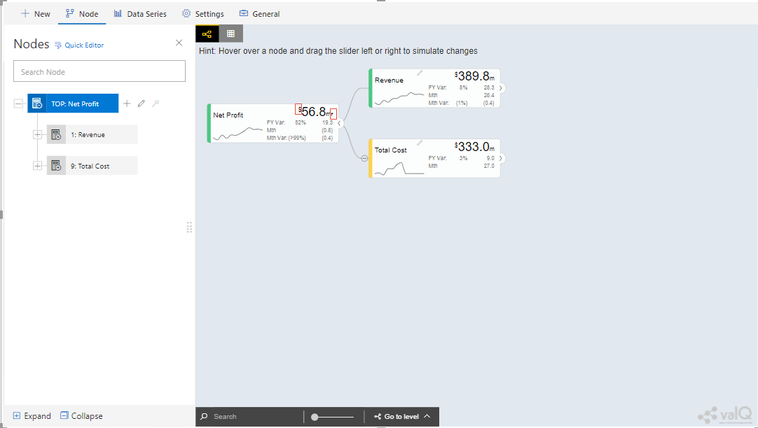
valQ with Display settings
From the above Figure, you can observe that the Node Display is set to “Show” option. The Scale has been set to the User Selected option and now you can edit the Scaling options in the Value Display under Settings Tab. When the Scale is set to other options you will not be able to edit the Scaling options in the Value Display. You can also view the Nodes with the values configured with Value Decimal Places as “0”, Value Prefix as “$” and Value Suffix as “r”.
Since the Details on Click option is enabled in the Display settings, you can observe the Pop up screen being displayed after clicking the Node “Net Profit” (see Figure below). If the Details on Click option is disabled in the Display settings, then you will not be able to view the Pop up screen.
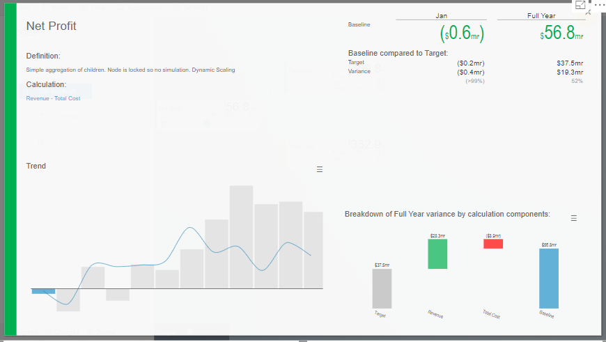
Pop up screen
Composite Node Display
A Node in a tree can now be added with a maximum of two composite nodes which can be taken from any nodes. For our example, the below Figure shows the Tree structure with several nodes.
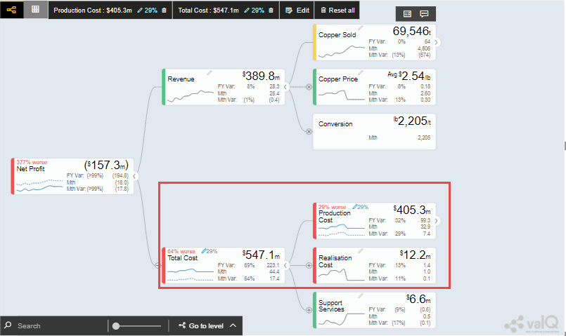
Tree with several nodes
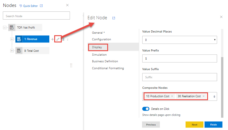
For our example, two child nodes from the Node “Total Cost” needs to be included as composite nodes to the Node “Revenue”. For adding the composite nodes, go to the configuration settings window of the Node “Revenue” by clicking the Edit and Configure Node option (see Figure below).
Adding Composite Nodes
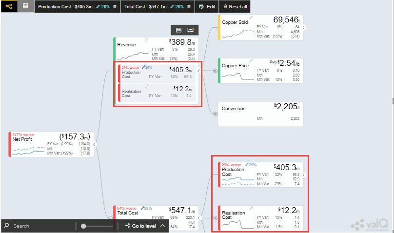
In the Edit Node panel, go to the Display settings and add the Nodes “10:Production Cost” and “36: Realisation Cost” as Composite Nodes to the Node Revenue (see Figure above). Now the Tree structure will get configured based on the above settings (see Figure below).
Tree with composite nodes
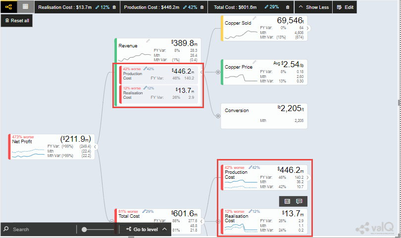
You can observe that the Nodes “10:Production Cost” and “36: Realisation Cost” have been added as the composite nodes to the node “Revenue”. Also when a simulation is done in the actual Nodes (10:Production Cost” and “36: Realisation Cost), the similar simulation will get reflected in the composite nodes and it is vice versa (see Figure below).
Composite Node with simulated values
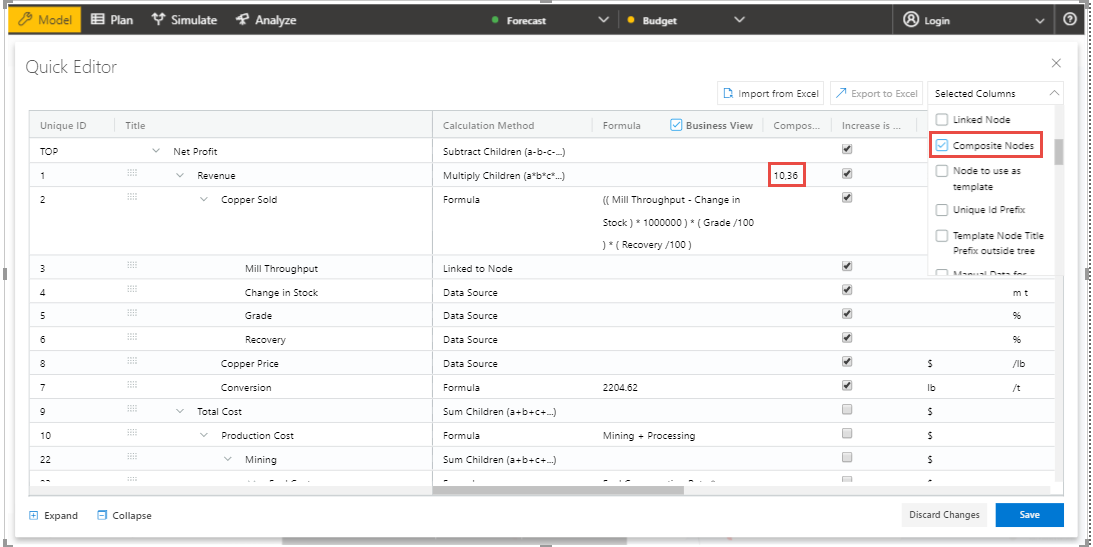
The composite nodes will have no effect in the Table view structure of the Tree. In the Quick Editor screen, you can view the composite node ids in a separate column by enabling the composite node option from the “selected columns” drop down menu (see Figure below).
Quick Editor with composite node id display
Simulation
In the Simulation Settings, you will be able to configure Simulation details such as selection of Default Simulation Method and assigning the Node for the Linked Simulation (see Figure below). You have the option to enable/disable the Simulation function for the Node (see Figure below).
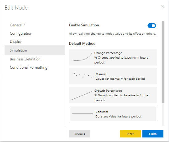
valQ with Simulation Settings
In this Simulation Settings, you have selected the Default Method as “Constant” for the Simulation and you have selected the Node for the Linked Simulation as “First Node” (see Figure above). Based on the above settings you will be able to view the valQ page as shown in the Figure below. The other options for the Default Simulation Method are Change Percentage, Manual and Growth Percentage.
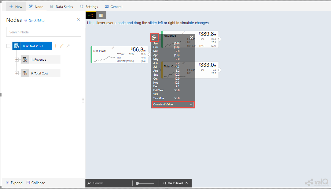
valQ screen with Constant value selection
From the above Figure, you will be able to view the pop window as shown in the above screen by clicking the Arrow icon in the Net Profit Node as shown in the Figure below.
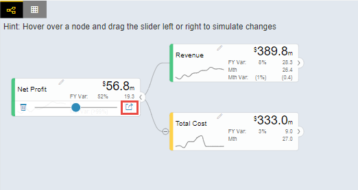
Net Profit Node
Now click the Edit option in the pop window as shown in the Figure below.
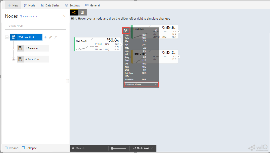
Edit option
By clicking the Edit option, you will be able to view and edit the input values for the Simulation Period (see Figure below).
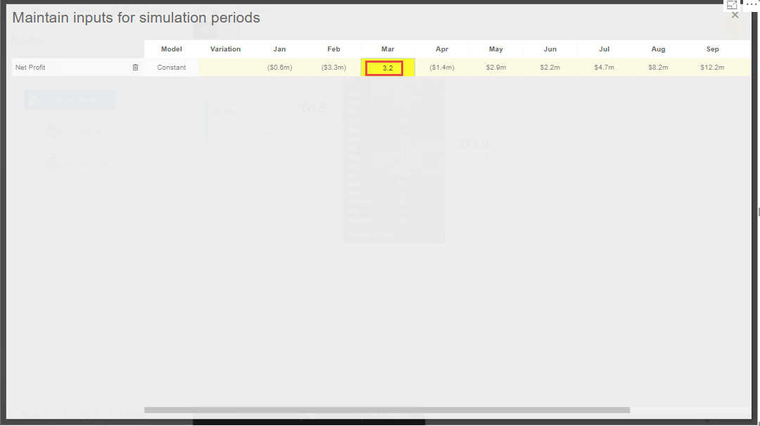
Edit Inputs for Simulation Periods
For our example, the value for March month has been edited and as a result it gets reflected for all the Nodes.
Business Definition
Using this option, you will be able to configure the Business Definition details such as Description, Header, Footer and Technical Notes with the values as shown in the below Figure.
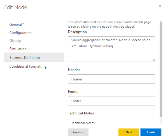
valQ with Business Definition Settings
Based on the above settings, you will be able to view the Business Definitions details in the Pop up screen as shown below.
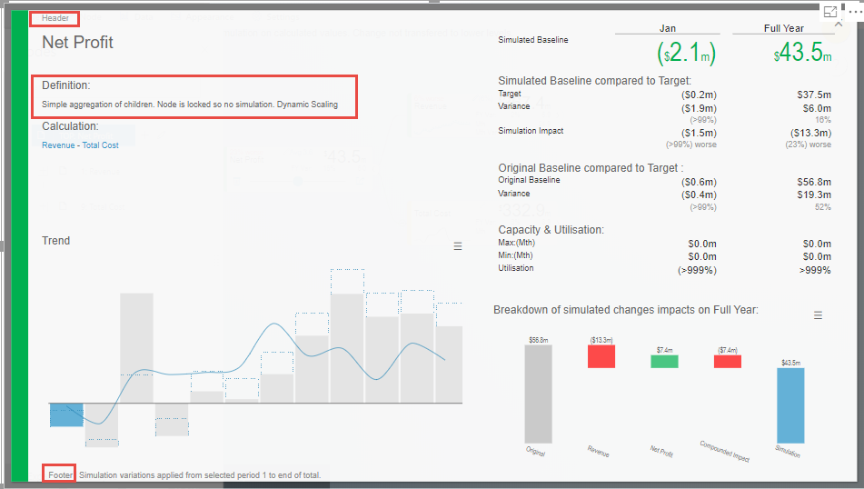
Pop up screen with Business Definitions
Conditional Formatting
Using the Conditional Formatting option, you will be able to apply the Alert Thresholds and Rules at the specific Node Level (see Figure below). For our example, the Node “Revenue” has been selected.
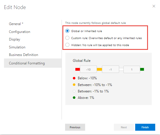
Conditional Formatting Settings for Node
In the Conditional Formatting settings for the Node “Revenue”, you have 3 different options as highlighted in the above Figure.
When the option “Global or Inherited Rule” is selected, then the Conditional Formatting Rules configured as Global Level in the Settings Tab will be applied here.
Now set the option as “Custom Rule: Overwrites default or any inherited rules” as shown in the below Figure.
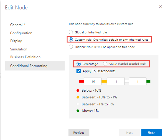
Conditional Formatting Settings for Node - Custom Rule option with Percentage selection
The Custom Rule option can be configured based on variance percentage values and the values applied at period level (see Figure above).
For our first example, set the option for the Custom Rule as “Percentage” and also enable the property “Apply to Descendants”. Set the Threshold values as shown in the above Figure. After simulation, you can find that the Variance percentage value for the Node “Revenue” falls in the Threshold range (4%)* which is between -10% to -1% and based on that condition, the status bar for the Node Revenue is yellow color (see Figure below).
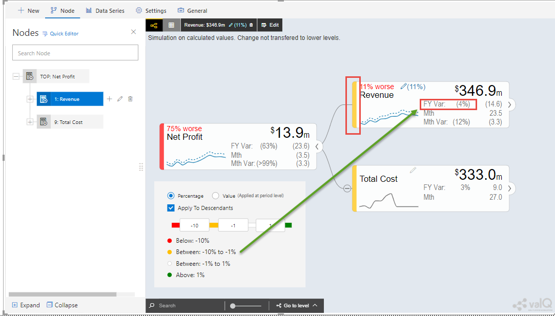
Custom Rule option with Percentage value selection for the Node “Revenue”
Also you can observe that the Descendant Node “Copper Price” has been updated with the same Threshold settings based on our configuration. The Variance percentage value for the Descendant Node “Copper Price” falls in the Threshold range (8%)* which is Above 1% and based on that condition, the status bar for the Descendant Node “Copper Price” is green color (see Figure below).
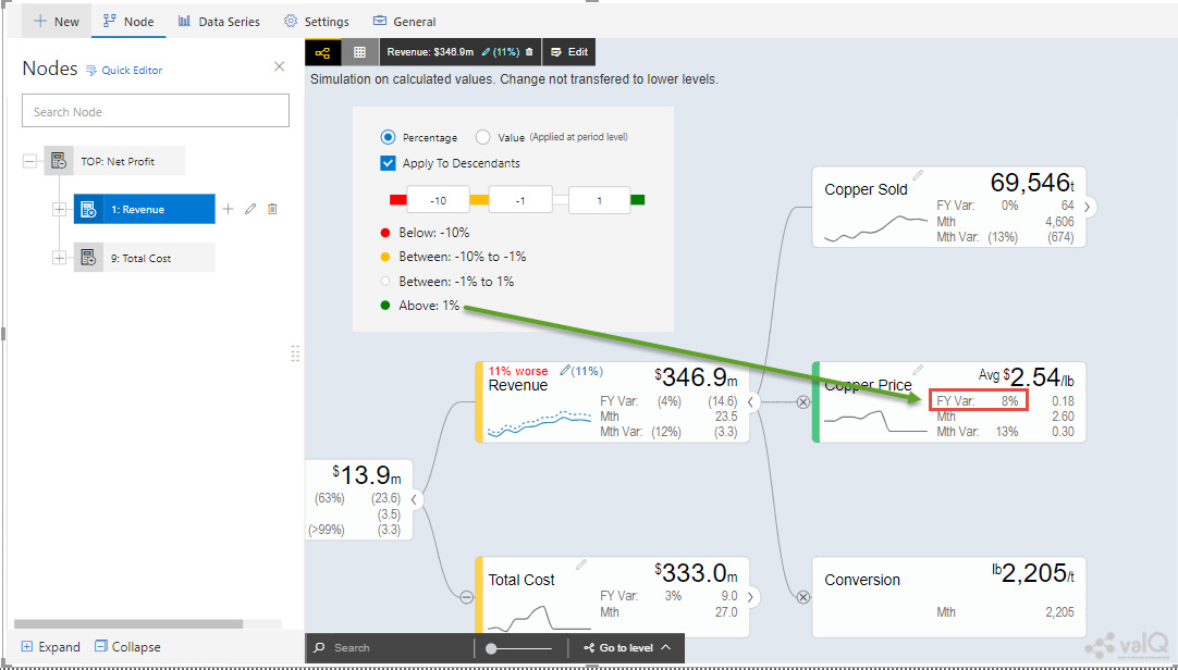
Custom Rule option with Percentage value selection for the Descendant Node “Copper Price”
For our second example, set the option for the Custom Rule as “Value (applied at Period Level) - see Figure below.
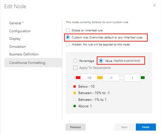
Custom Rule option with value selection for the Node “Revenue”
Set the Threshold values as shown in the above Figure. After simulation, you can find that the Metric value for the Node “Revenue” falls in the Threshold range (522.3)* which is Above 1 and based on that condition, the status bar for the Node Revenue is green color (see Figure below).
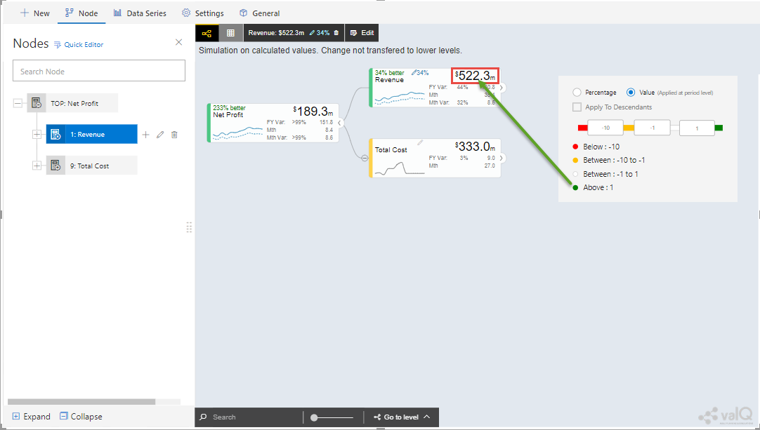
Custom Rule option with Value selection for the Node “Revenue”
Note: “*” denotes that the Metric values get calculated based on the Period Level. For example when it is a Year, it will take the value of 12 being multiplied with the range value that we provide.
Now set the option to “Hidden: No Rule will be applied to this Node”. You can observe that no range values can be provided for the Conditional Formatting and since there will be no status color for that Node being simulated.
Secondary KPIs
Secondary KPIs helps user to aggregate and visualize additional or alternate KPI values in the node widget. Specifically, in a model with two data series, these are the set of secondary metrics captured under the primary value of the node
As a default, there are three secondary values displayed for a dual series data in the following order i. Full Period Variance between baseline and comparison metric (in % and absolute values) ii. Baseline metric value for the first period in the series iii. Variance for the first period between baseline and comparison metric (in % and absolute values)
Secondary KPI option lets users to customize these secondary values or metric according to their preference
Users can achieve this using: I. Secondary KPI option based on Formulas II. Secondary KPI option based on Template
Secondary KPI option based on Formulas
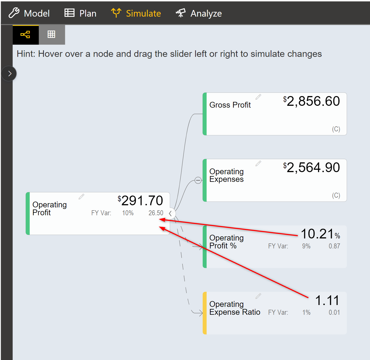
In the below model screenshot, the user can display the data value from Operating Profit %’ and ‘Operating Expense Ratio’ as Secondary KPI values to the TOP node ‘Operating profit’.
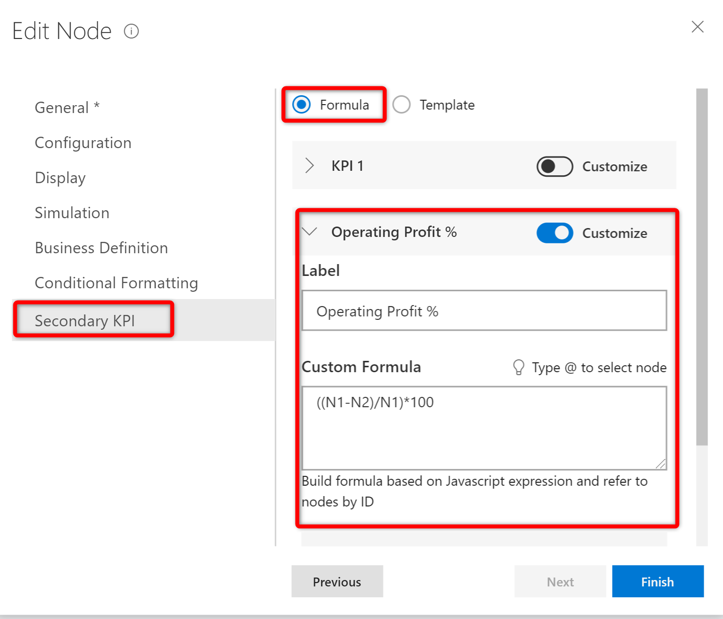
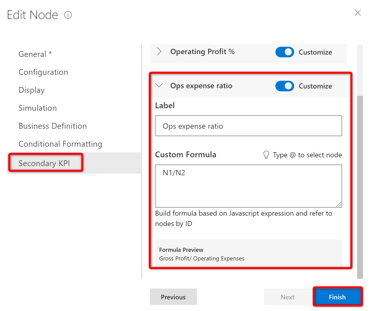
Under the ‘Operating Profit’ node setting’s ‘Secondary KPI’ ribbon, user needs to select the ‘Formula’ button and fill-in the label name and the custom formula for his additional Secondary KPIs
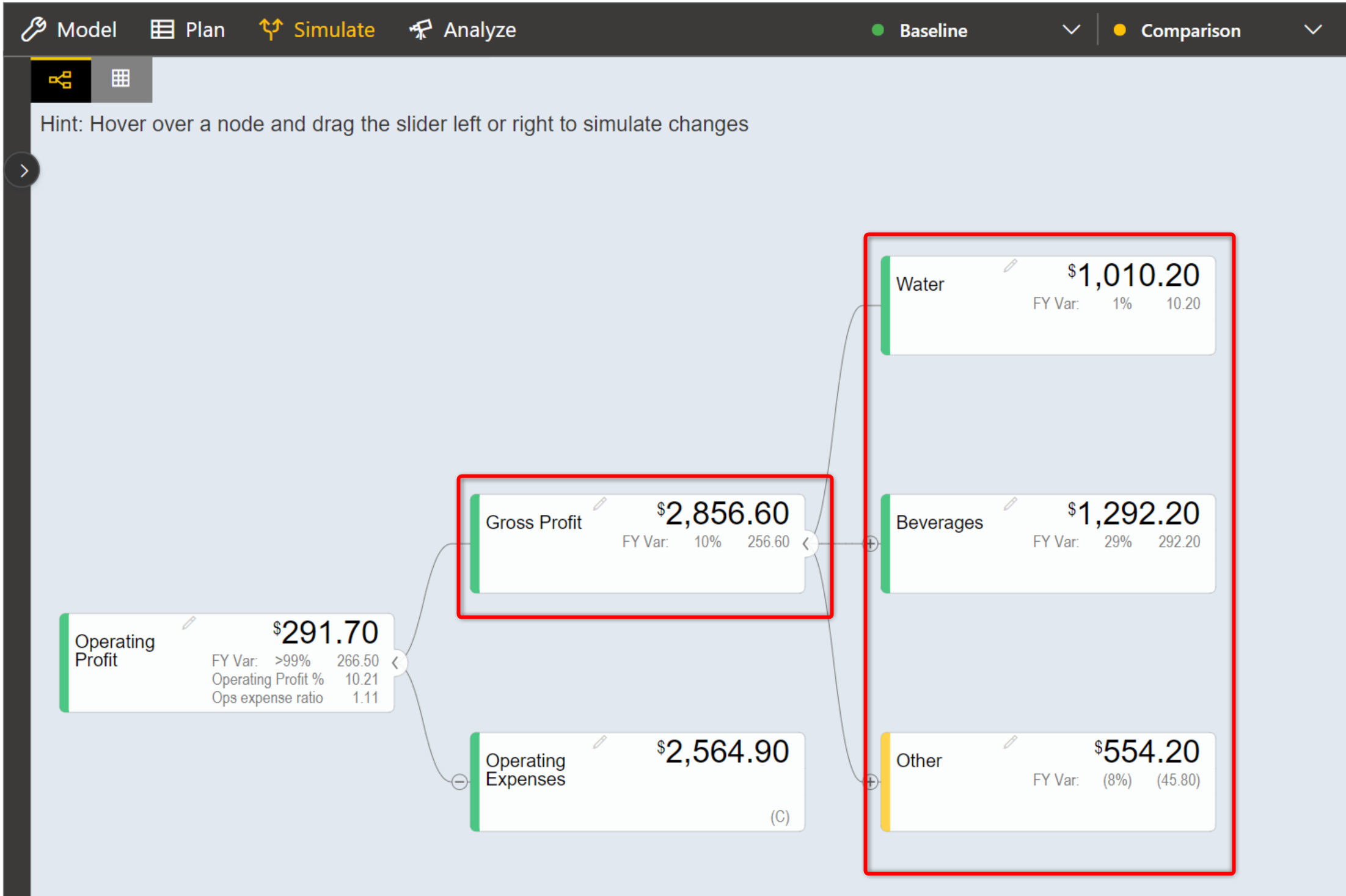
Upon completing, the user can see ‘Operating Profit %’ and ‘Ops Expense Ratio’ values displayed as Secondary KPI values to ‘Operating profit’
Secondary KPI option based on Template
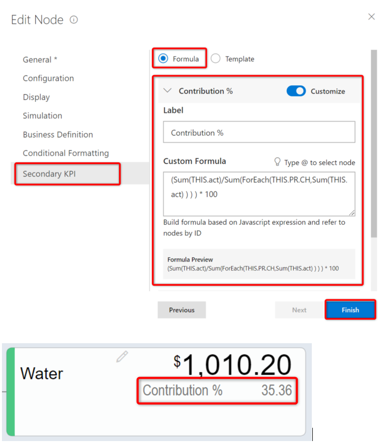
In the model, user can display ‘Contribution’ of each of the child nodes Water, Beverages, and Others to their parent node Gross Profit. User should define ‘Contribution’ as a Formula in one of the nodes and call them out for ‘Contribution’ calculation using the Template option at the other nodes.
In this example, user can define the formula in ‘Water’ node under the node setting’s Secondary KPI by selecting ‘Formula’ button and defining the ‘Custom Formula’ Upon completion, ‘Contribution %’ is displayed as a Secondary value of the node widget.
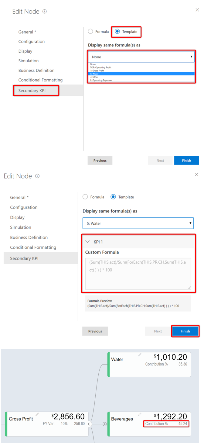
To borrow this formula on other nodes, user can fo into the Secondary KPI setting of the ‘Beverages’ node, select the ‘Template’ button, and choose to display the same formula as the ‘Water’ node. User can instantly see the corresponding ‘Contribution %’ at the ‘Beverage’ node.
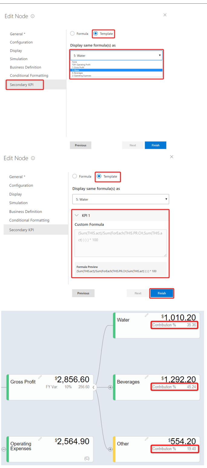
Similarly, following the same steps for the ‘Other’ node helps the user to instantly visualize ‘Contribution %’ for the all the child nodes to Gross Profit
Create a Simple Model
Using this option, it is very simple for the beginners to create a tree automatically based on their own data source. By clicking the Create a Simple Model option, you will be able to view the valQ screen as shown in the below Figure.
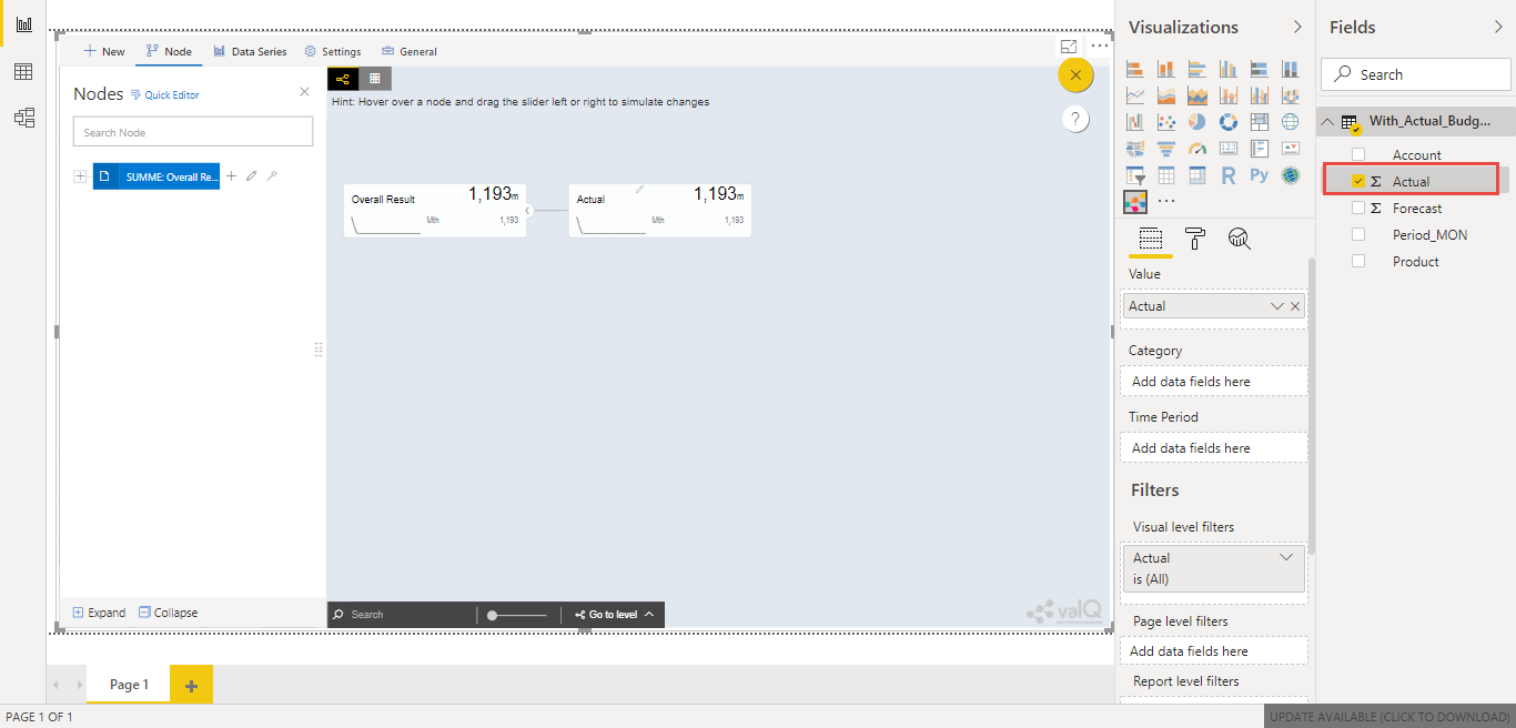
Simple Dynamic Tree created with one single Measure
By default, the Measure “Actual” has been selected as a Mandatory criteria for getting the Tree widget. Now you can select the other Measures and Dimensions based on your choice as indicated in the Figure below.
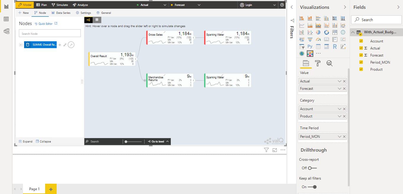
Simple Dynamic Tree created with Measures and Dimensions
From the above Figure, you can observe that the other Measure “Forecast” is assigned to “Value” and the Dimensions namely Account and Product has been assigned to the “tab” and the Period_MON is assigned to “Time period”. Now based the assigned data source, the Tree is being configured. Hence now you can create a tree directly from your data. For step by step instructions on how to get started to build a Dynamic Model, please follow this link: https://ValQ.com/wp-content/uploads/ValQ-for-microsoft-power-bi-beginners-tutorial.pdf.
Note: For Dynamic Model, you will be able to view the Root Node and first three Nodes in the next level hierarchy under the Sub Models section of the Navigation Panel (see Figure below).
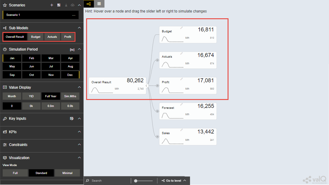
Sub Models Section showing the Root Node and first three Nodes in the next level hierarchy
Read only Dynamic Tree in Editor
When Dynamic Model is selected, you will be able to only view the value driver tree with Parent and Children Nodes and you cannot undergo any configuration part on it. But you can generate a copy of the Parent Node and proceed with configuration part based on your choice (see Figure below).
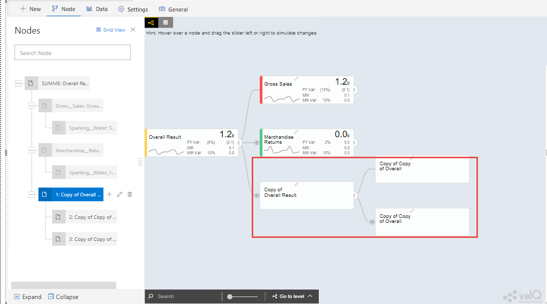
Read Only Dynamic Tree
Dynamic Scaling on Dynamic Tree
Based on your data source, the value driver tree will get generated and the Number Scaling for all the Nodes will be updated appropriately based on the data source (see Figure below). For our example, the Number Scaling is “0.0b”.
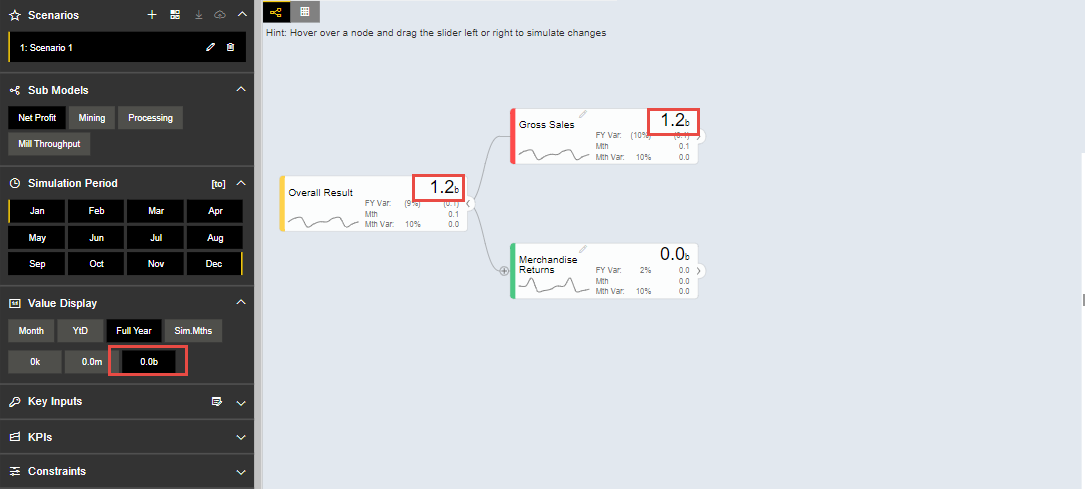
Dynamic Scaling on Dynamic Tree
As part of the New Release, you have the option to convert the Dynamic Model to an Advanced Model (see Figure below).
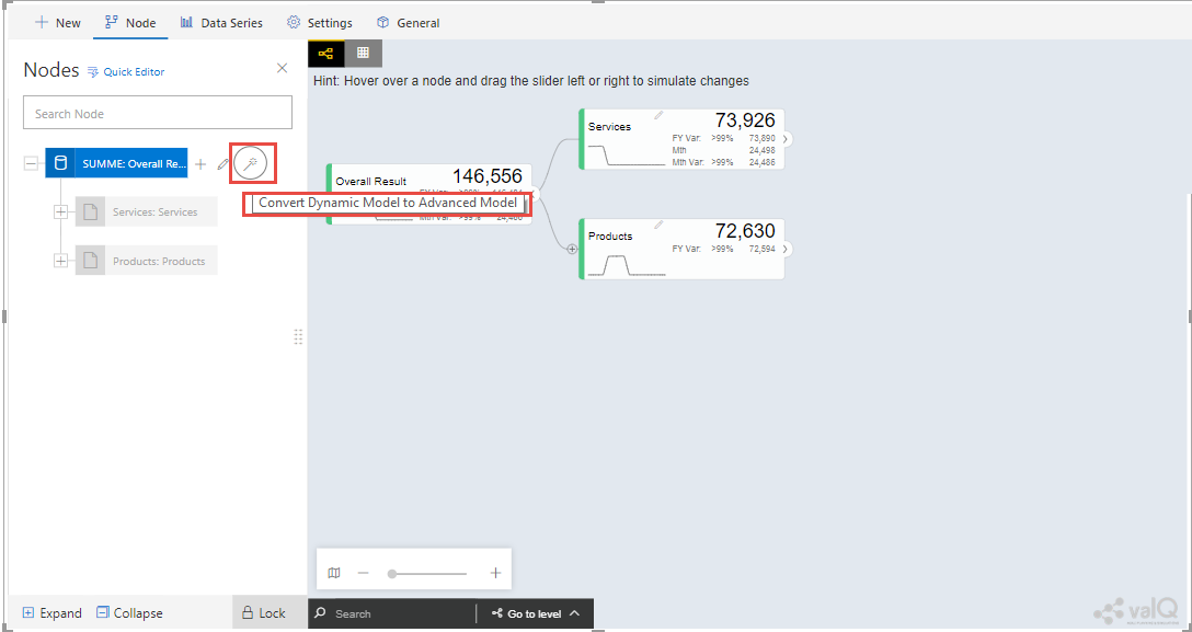
Option for converting Dynamic Model to an Advanced Model
When the option is clicked, now you will be prompted for the Message window as shown below.
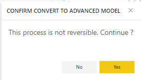
Confirmation Message
After clicking Yes, you will be able to edit the configuration for all the level of Nodes similar to the Advance Model (see Figure below).
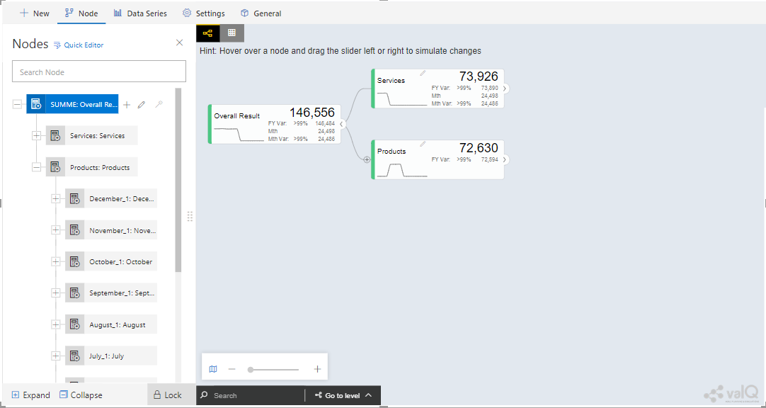
Dynamic Model converted to an Advanced Model
Create an Advanced Model
This option is used to create a Tree in valQ manually Node by Node based on your choice. By clicking the Create New from Scratch option, you will be able to view the valQ screen as shown in the below Figure.
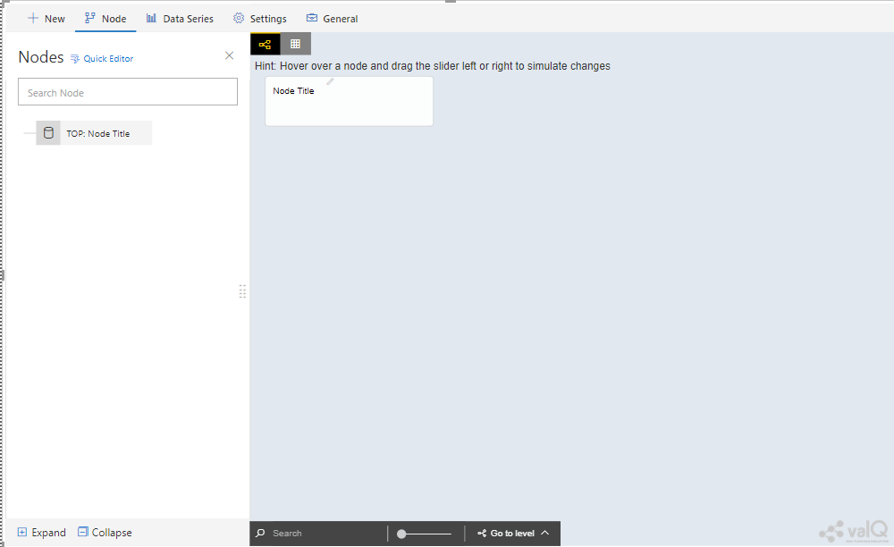
Create New from Scratch
For our example we have created a Parent Node and two child Nodes (see Figure below).
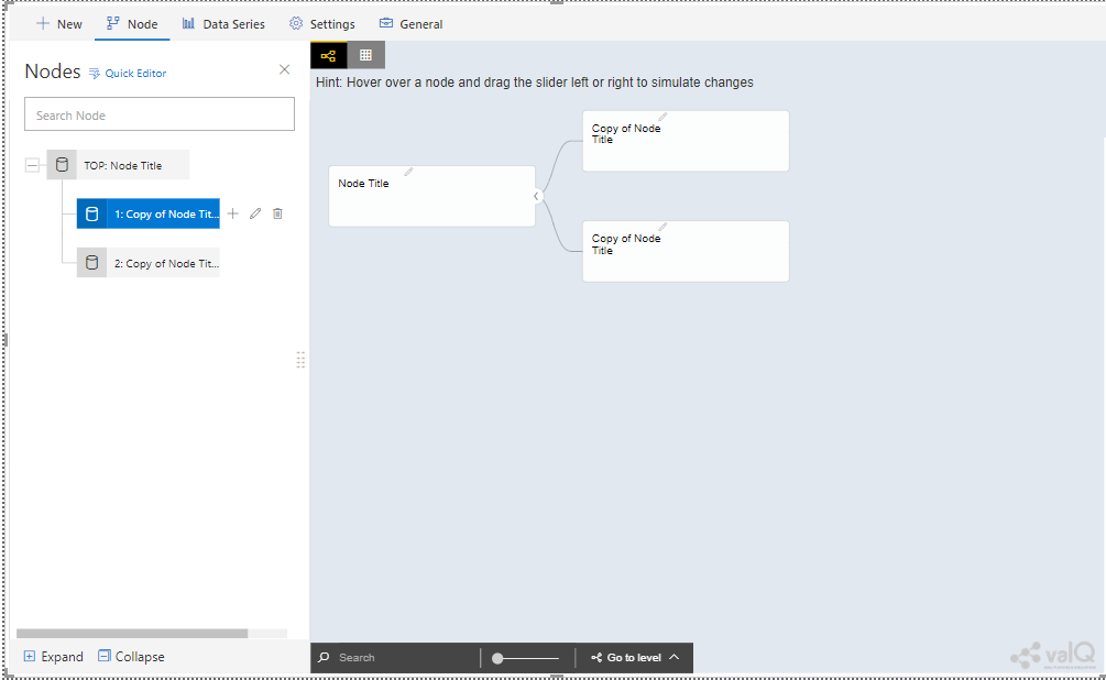
Tree with one Parent Node and two Child Nodes
Now with the help of Section: Open a Sample Model, you will be able to configure the General, Configuration, Display, Simulation, Business Definition and Conditional Formatting settings for the Tree (Please refer Section: Open a Sample Model for more details).
Import an Advanced Model
Using the “Import an Advanced Model” option, you will be able to import data through two different options as shown below.
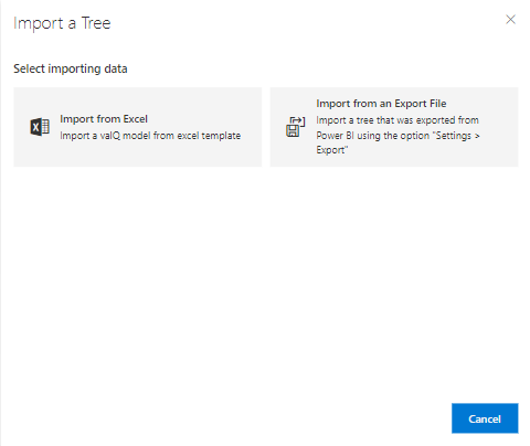
valQ – Import from Excel
Import from Excel
Using the option “Import from Excel”, you will be able to paste the JSON File Data Format text into the Text Editor as shown in the below Figure.
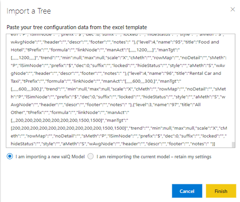
Configuration Data from Excel Format
Now based on the above configuration, you will be able to view the Tree formed with Nodes in the valQ screen.
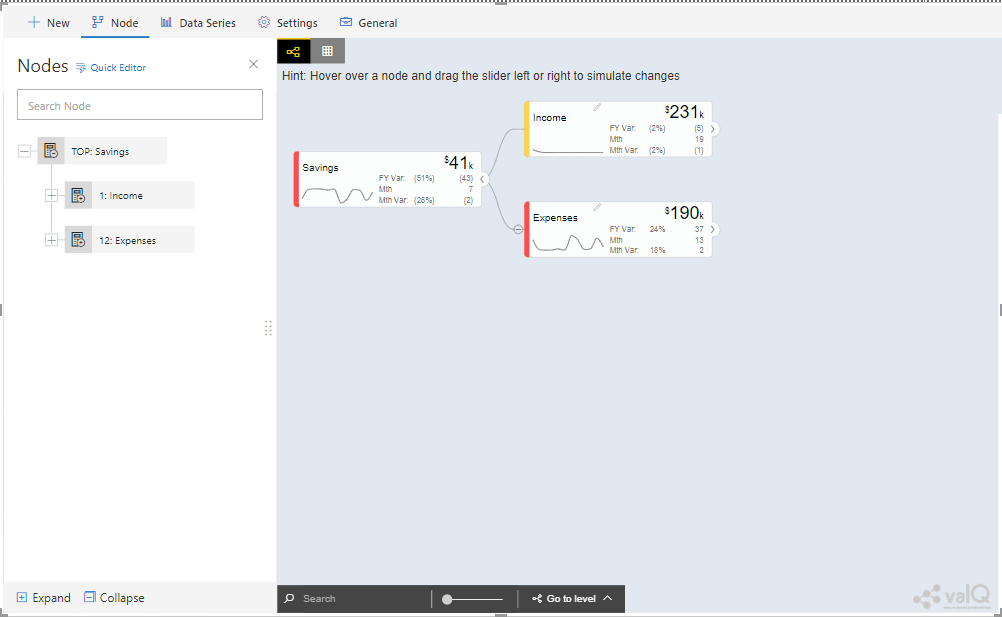
valQ screen derived from Excel Data
As part of the New Release, you will be able to retain the existing Navigation Panel configuration and apply the same for the next Tree configuration. For our example, the Figure below shows the Navigation panel for the first Tree configuration.
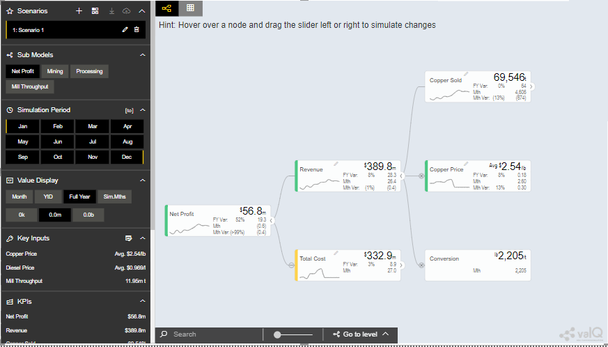
Navigation Panel for the first tree configuration
Now navigate to the Import an Advanced Model option in New Tab and paste the JSON File Data Format text for the second tree into the Text Editor as shown in the below Figure.
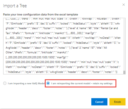
Import a Tree
Now select the option “I am reimporting the current model – retain my settings” so that you will able to view the second tree configuration being applied with the Navigation Panel settings already configured for the first tree (see Figure below).
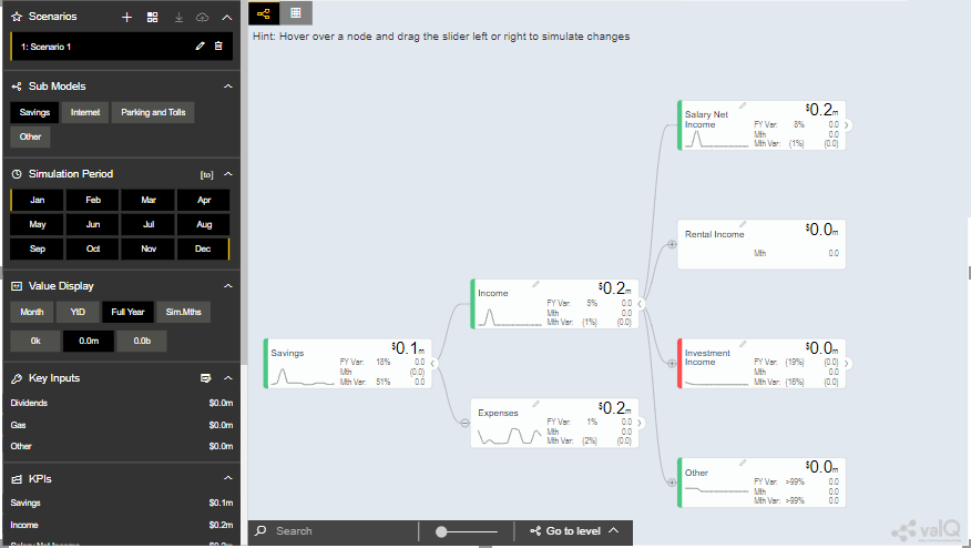
Navigation Panel for the second tree configuration
Import from an Export File
Using this option “Import from an Export File”, you will be able to paste the Export file data format from an already exported tree data as shown in the below Figure. This Export File will be generated by navigating to the Settings Tab and by clicking the Export button.
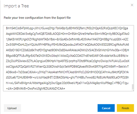
Configuration Data from Export File Data Format
Now based on the above configuration, you will be able to view the Tree formed with Nodes in the valQ screen.
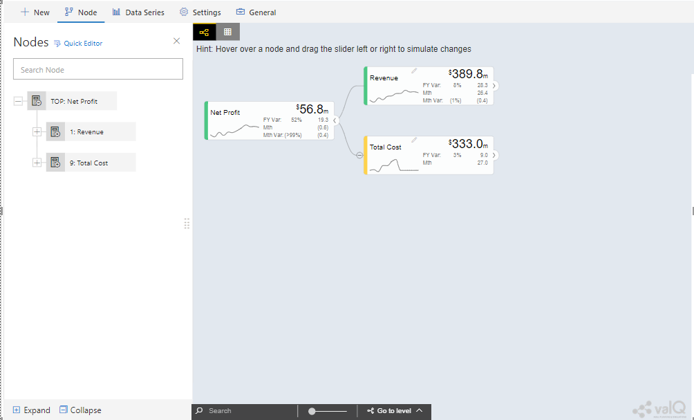
valQ screen derived from Export File Data Format
Additional Properties of New Tab
Property |
Description |
|---|---|
Open a Sample Model |
Using this model, you can load the required model from the sample valQ Models. The sample Models are Mining Industry, P&L for Small and Medium-Size Business, Personal Finance and Simple Sales Projections. |
Create a Simple Model |
Using this Model, you can build a Dynamic valQ Model (For details, please refer: https://ValQ.com/wp-content/uplo ads/ValQ-for-microsoft-power-bi-b eginners-tutorial.pdf ) |
Create an Advanced Model |
Using this Model, you can import a Tree by selecting the data from an Excel file or by selecting the data from an Export File. |
Import an Advanced Model |
This Model can be used for creating a Tree with Nodes right from the beginning. |
Additional Properties of New Tab
Node Tab
Each node represents a metric, and can contain the following:
Name of the value driver or KPI
A sparkline graph indicating the recent trend
The value of the metric in bold letters

Node Details
In addition, each node also contains several performance metrics (see Figure below). They are listed as follows:
The Fiscal Year variance of the metric vs. a benchmark (in this case, Sales Forecast vs. Sales Budget) – this is shown in both % and absolute terms
Absolute value of the metric for the current month (usually the first period in the series)
Variance of the metric vs. a benchmark for the current month – this is shown in both % and absolute terms.
A node may be decorated by a performance indicator color band on the left – typically Green (for good), Amber (neither good nor bad) and Red (Poor).
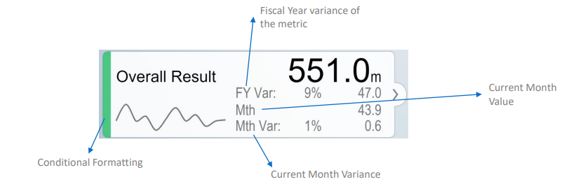
Node Details
The entire configuration part of the Node Tab has been already explained in detail in Section: Open a Sample Model.
Quick Editor in Node Tab
Using the Quick Editor option in the Node Tab, you will be able to view the entire Tree Hierarchy in a Grid View. For our example, the below Figure shows the normal Tree Hierarchy View.
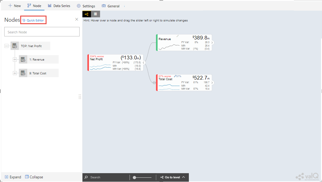
Normal Tree Hierarchy View
After clicking the Quick Editor option as shown in the above Figure, you will be able to view the Grid View as shown below. You can observe that there will be a Business View information in the Formula column and it will get displayed when you select the Business View option (see Figure below).
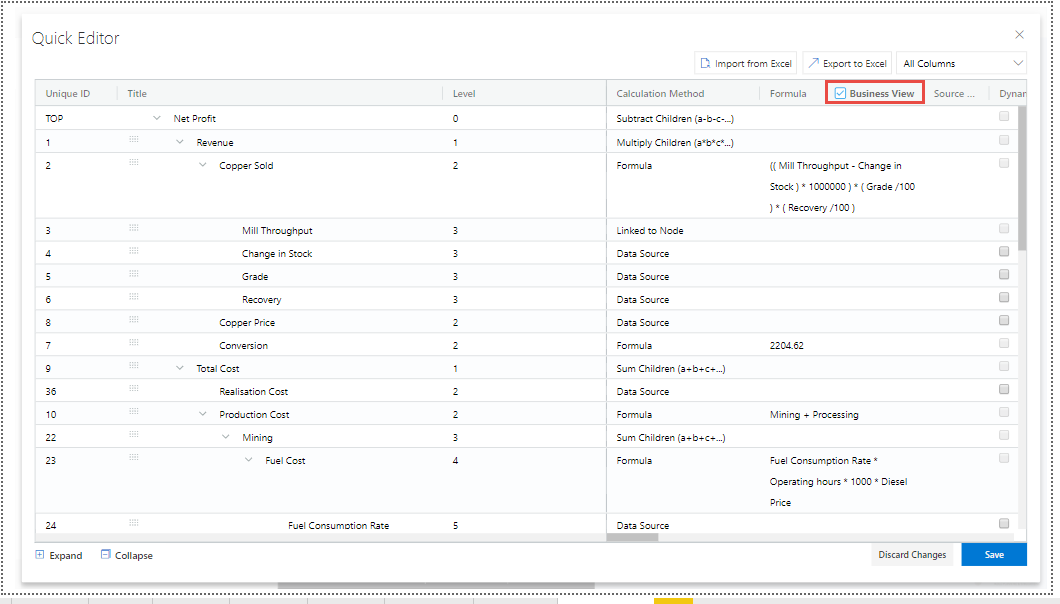
Grid View
In the Grid View, you will be able to edit the changes and save it so that the changes will get reflected in the Tree Structure which can be viewed in the canvas. In the Grid View, you can also Expand and Collapse the Node Structure using the Expand and Collapse icons (see Figure below).
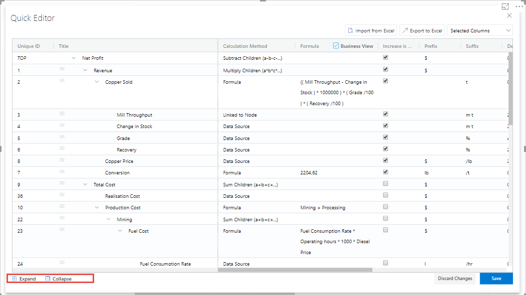
Grid View in Expanded Form
For our example, the above Figure shows the expanded form of the Grid View. The below Figure shows the collapsed form of the Grid View.
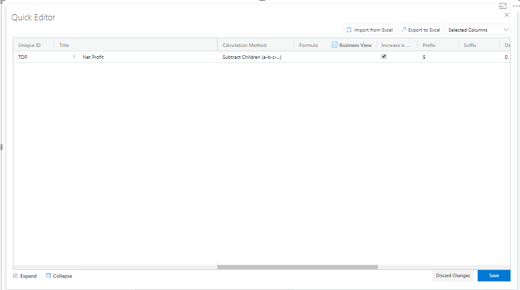
Grid View in Collapsed Form
You will be able to import and export the data in the form of excel file using the Import from Excel and Export to Excel buttons as shown in the below Figure.
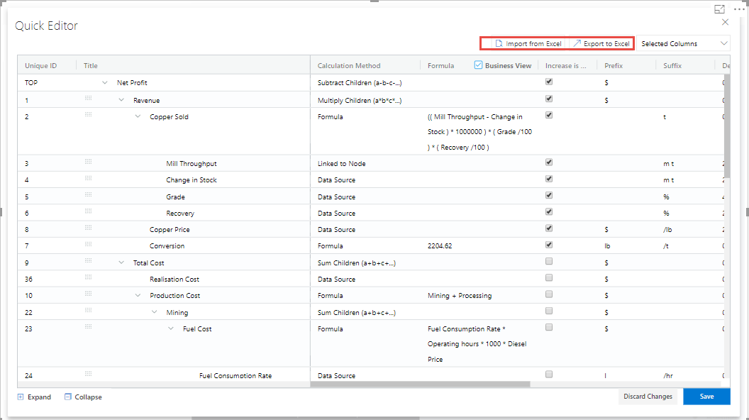
Grid View - Import from Excel and Export to Excel
The Export to Excel File button will be only functional in the web version of the Power BI (see Figure below).
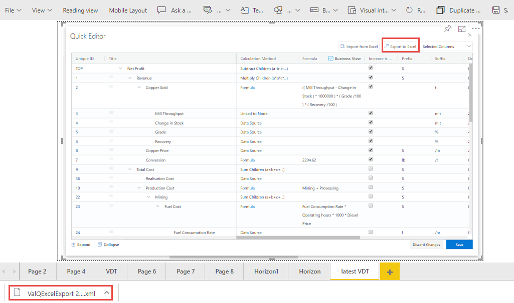
Export to Excel File
The exported file can be edited and it can be imported by clicking the Import from Excel File button.
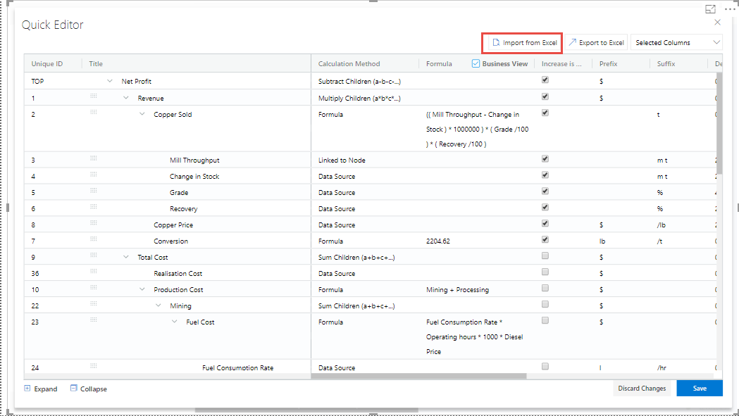
Import from Excel File
The import function can be done by browsing the location of the file (see Figure below).
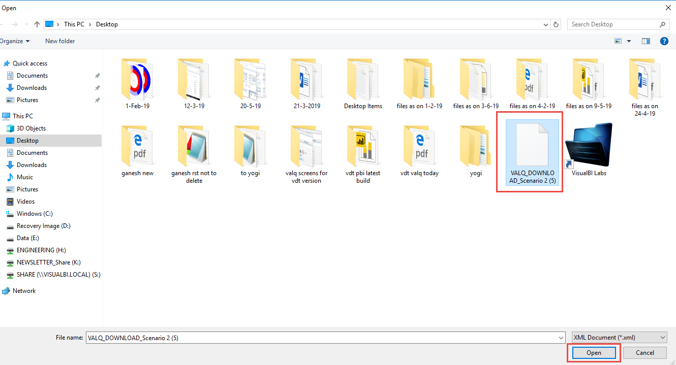
File Location
The Columns cab be filtered based on the selection from “Selected Columns” Drop Down (see Figure below). All the Columns can be selected to get displayed in the grid or the user can select the columns of their choice.
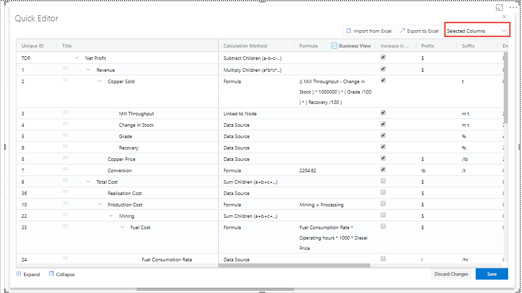
Filtering Columns in the grid
The below Figure shows that all the columns are being selected and they are displayed in the grid. The user can scroll the Horizontal scroll bar in order to view the remaining columns.
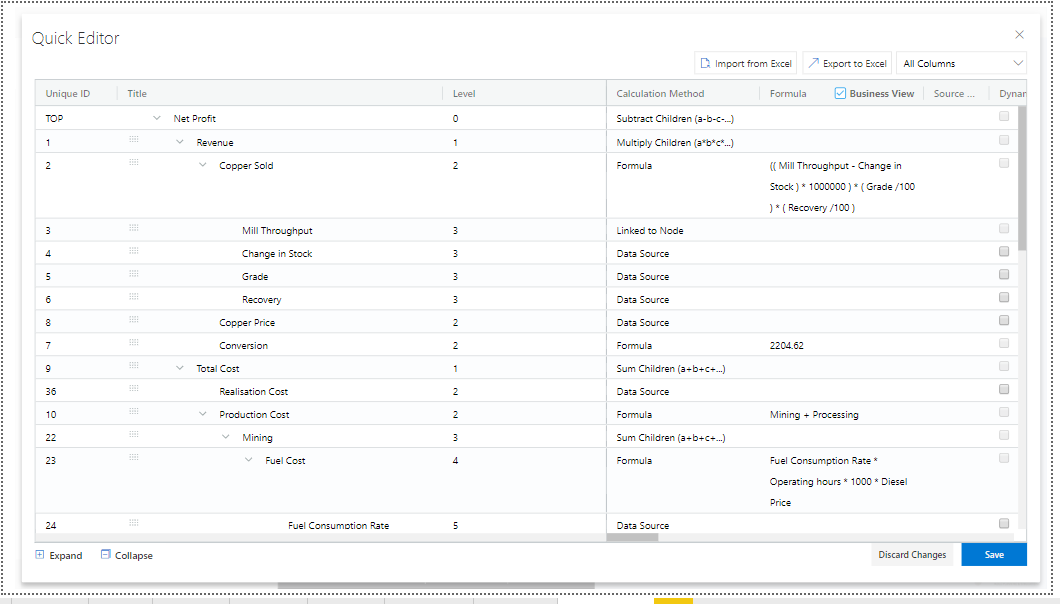
Grid Display with all the columns being selected.
The below Figure shows that only the selected columns get displayed in the grid.
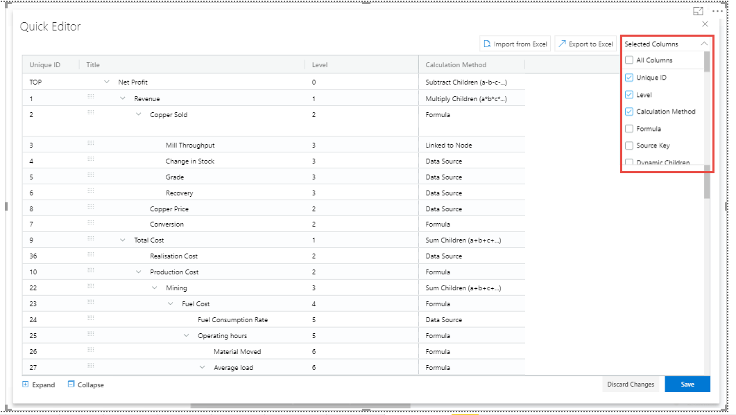
Grid Display with the selected columns
Also the user has the option to edit the properties like Formula, Calculation Method and Aggregation Method directly in the Grid view where it gets updated in the actual properties in the Advanced Editor. In our example, you can view that the Formula has been double clicked for editing (see Figure below).
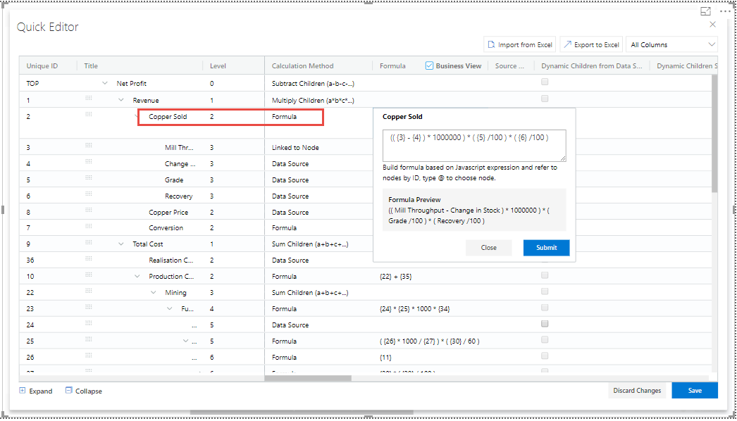
Grid view edit for Formula Column
The above Figure shows that the Formula for the row item Copper Sold has been edited. As another example, the below Figure shows that the Calculation Method has been edited.
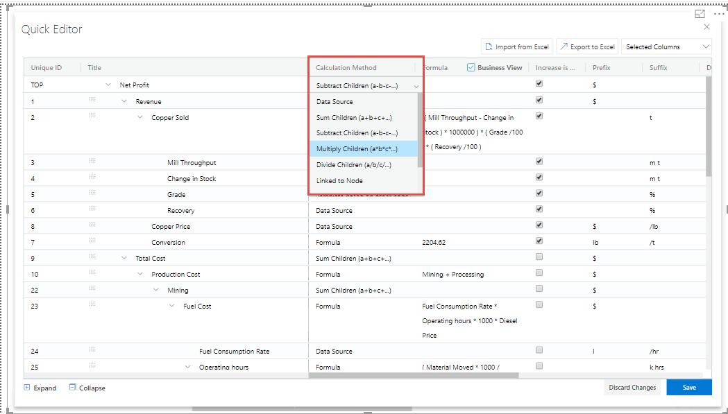
Grid view edit for Calculation Method Column
In a similar way, the following columns can be edited in the Grid view.
Manual Data for Primary
Manual Data for Comparison
The below Figures represents the screen shots for both Manual Data for Primary and Manual Data for Secondary.
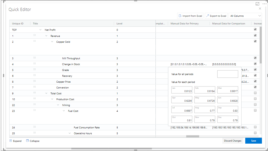
Grid View Edit for Primary Data
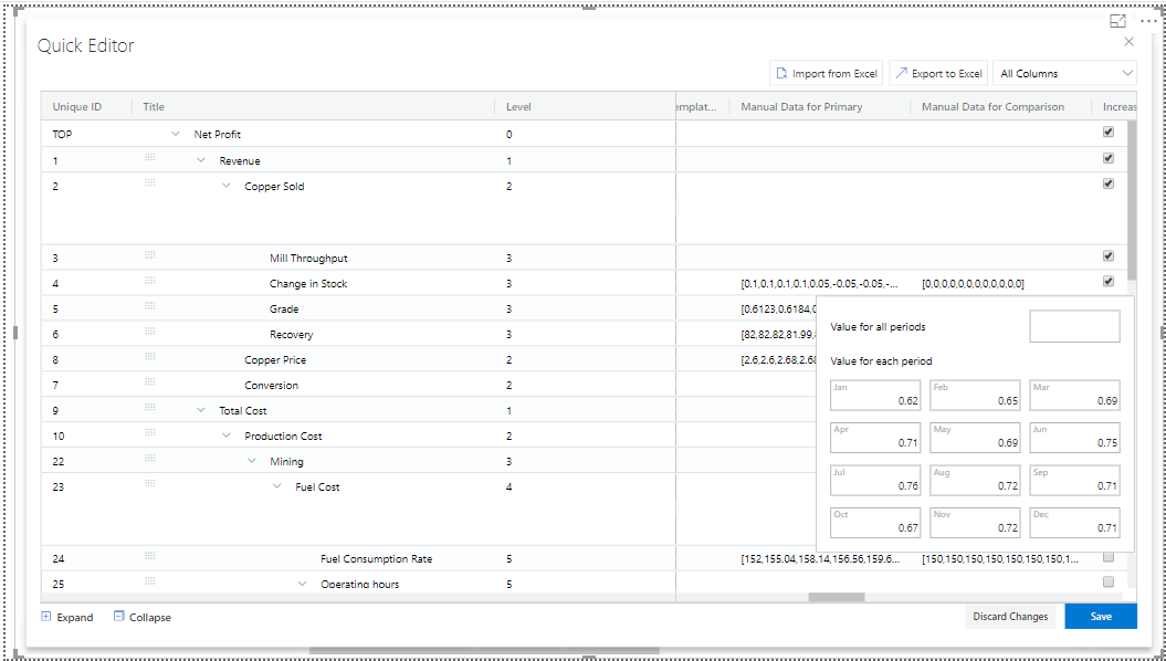
Grid View Edit for Comparison Data
The Node Search for the columns Linked Node, Linked Simulation Node and Weighted Average Node in the Data Grid will be in Drop Down List and the user can select the appropriate Node from the Drop Down List. For our example, the Node Search for the Linked Simulation Node has been done (see Figure below).
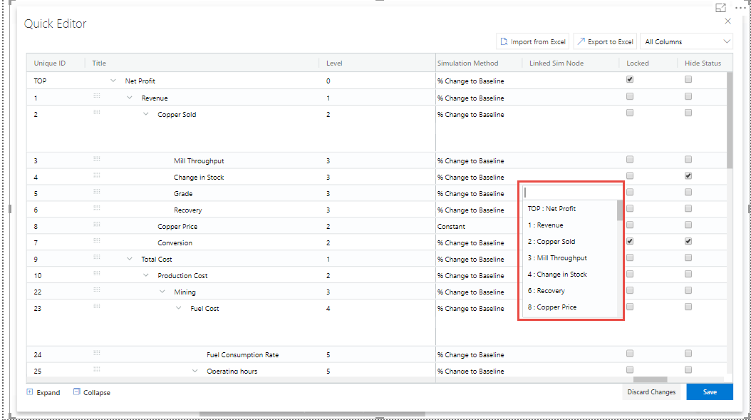
Node Search for Linked Simulation Node Column
Similarly the Node Search for the Source Key Column will be in Drop Down List showing the Nodes from the assigned Data Source and the user can select the appropriate Node from the Drop Down List (see Figure below).
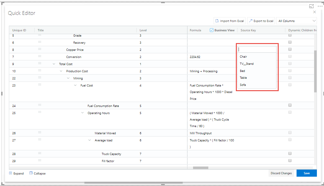
Node Search for Source Key Column
There is an option to lock the simulation for the Node in the Grid View. The same function can be also done in the exported Excel File and the Excel file can be imported in the Grid to see the updates done for the locked simulation.
The below Figure shows the Locked Simulation in the Grid View.
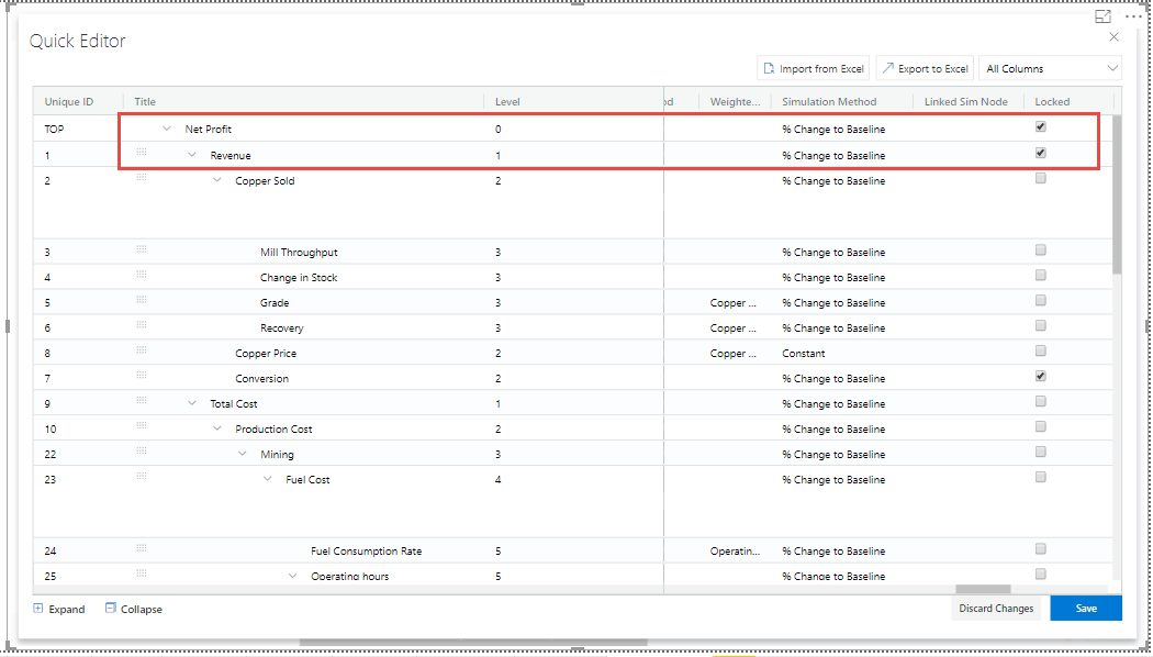
Locked Simulation in Grid View
The below Figure shows the Locked Simulation in the Excel File which can be imported to the Grid view.
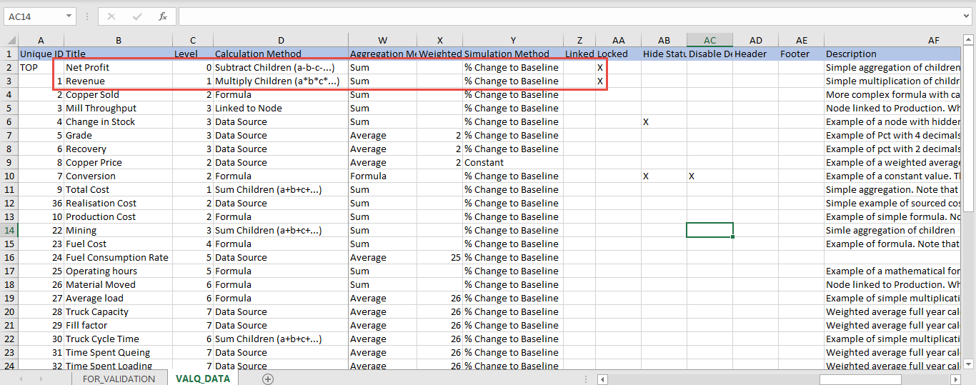
Locked Simulation in Excel File
The rows can be reordered for the child nodes which exists under a Parent Node. The below Figure shows the Grid view before reordering the child nodes.
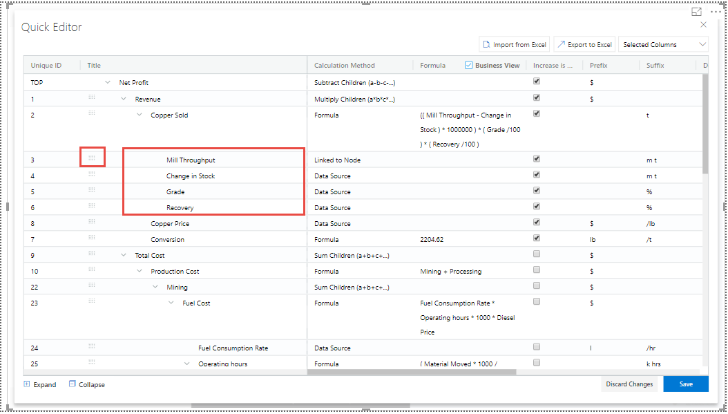
Grid view before reordering the child nodes
The below Figure shows the Grid view after reordering the child nodes.
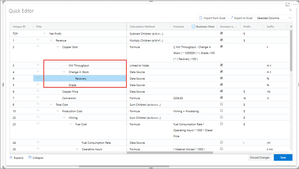
Grid view after reordering the child nodes
Additional Properties of Node Tab
Area |
Property |
Description |
|---|---|---|
General |
Unique ID |
This property shows the Unique ID for the Node and it can be edited. |
Title |
This property sets the Title for Node. |
|
Title Prefix when outside Tree |
This property sets the Title Prefix for the Node when outside the Tree. |
|
Configuration |
Calculation Method |
This property sets the Calculation Method for the Node. The options are Data Source, Sum Children (a+b+c….), Subtract Children (a-b-c….), Multiply Children (a*b*c….), Divide Children (a/b/c….), Formula, Linked to Node, Manual and Templated based on other node. Note: When the Calc. Method is selected as Linked to Node option, then you can select the desired Node from the Nodes List. |
Source Key |
This property sets the Source Key for the Node. You can map the Node value with data source using the source key. |
|
Time Aggregation |
This property sets the Time Aggregation for the Node. The options are Sum of Periods, Average, Formula, Last and Cumulative. |
|
Desired Trend |
This property sets the Desired Trend for the Node. The options are Decrease and Increase. For example, the desired Trend for the Revenue usually increases and the desired Trend for the Cost decreases. |
|
Value Range |
This property sets the Value Range for the Node. |
|
Dynamic Children from Data Source |
If the referenced data source row is a hierarchy node with children or has dimension below in the data source, the children can be automatically generated based on the data source. If Node Mapping selected is “Automatic based on text” then any special character and space in the member text will be replaced by “__”(double underscore) in the Unique Id for the Node. Eg. “Total Cost” will become “Total__Cost”. |
|
Dynamic Children Simulation |
Children settings will generally be cascaded from the configuration of this node except visualization, calculation method and simulation. The children will always be with visual style normal. Aggregation formulas can dynamically be generated and simulation feature set based on the below options like All, Nodes w/o children and None. |
|
Display |
Node display |
This property decides on how the Node will be displayed in the Tree Widget. The options are Show, Derived and Hidden. |
Scale |
This property sets the Scale for the Node. The options are None, User Selected, 0m, 0k and Pct. |
|
Value Decimal Places |
This property sets the Value Decimal Places for the Node. The range is from 0 to 7. |
|
Value Prefix |
This property sets the Prefix Value for the Node. |
|
Value Suffix |
This property sets the Suffix Value for the Node. |
|
Details On Click |
This property shows the Pop up screen upon clicking. |
|
Simulation |
Enable Simulation |
This property enables or disables the Simulation. |
Default Method |
This property sets the Default Method for the Simulation. The options are
|
|
Linked Simulation |
Using this property, you can select the desired Node from the Nodes List for Linked Simulation. It updates the simulation concurrently with the Linked Node. |
|
Business Definition |
This information will be included in each node’s details page (open by clicking on the node in the tree widget). They are listed as follows:
|
|
Conditional Formatting |
The Conditional Formatting Rules can be set for the Tree. The options are
You can set the values for the Color Range. When the option is selected as “Custom Rule”, then you can configure the Range values at Simulation/Variance Percentage and Node values applied at Period Level. |
Additional Properties of Node Tab
Data Series Tab
Using the “Data Series” Tab, you will be able to configure the Data settings for the Tree created in valQ. There are 3 different options as listed below to configure the data settings for the Tree (see Figure below).
Data Series Manager
Time Aggregation Labels
Data Sorting
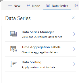
Data Series Tab
Data Series Manager
Using the option “Data Series Manager”, you will be able to configure the Periods and Data Series for the Tree (see Figure below).
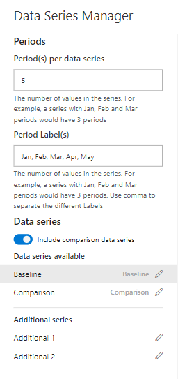
Data Series Tab – Data Series Manager
For our example, we have the data source having periods from Jan to Dec, Budget and Forecast values. The Budget values will be the Comparison values and the Forecast values will be the Baseline values. Follow the below steps for configuring the values in the Data Series Manager.
Set the property Period(s) per data series to the value 5.
Configure the Period Labels as Jan, Feb, Mar, Apr, May (see Figure above).
Enable the property Include comparison data series. You can view both the Baseline and Comparison values.
When the property Include comparison data series is disabled, then you will be able to view only the Baseline Series.
Since our data set has the Additional values Additional 1 and Additional 2, it will be displayed as Additional Series (see Figure above).
When you click the Baseline label, you will be able view the Baseline values as Forecast values as shown below.
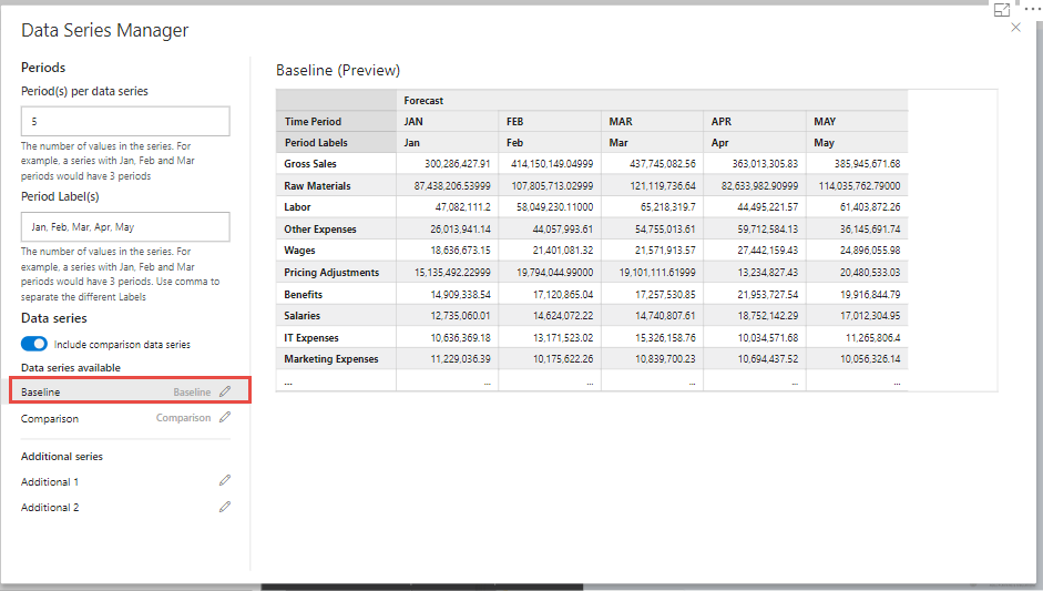
Baseline Values
When you click the Comparison label, you will be able view the Comparison values as the Budget values as shown below
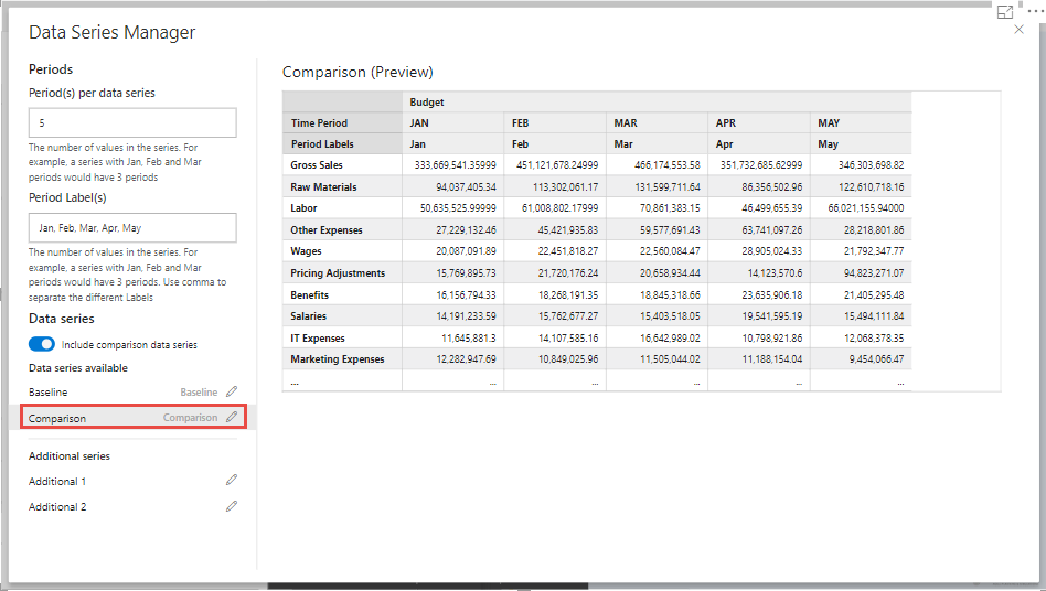
Comparison Values
Based on the above set of configuration steps, you will be able to view the valQ screen as shown below.
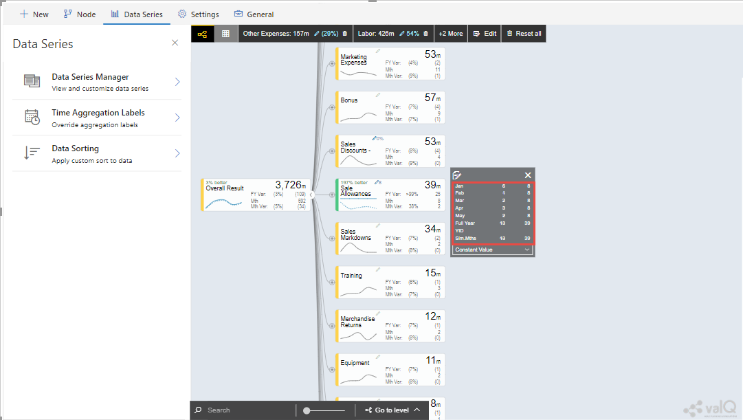
valQ screen configured with Periods and Data Series
You can observe from the above Figure that after simulating the Node Sale Allowances, you will be able to view the Baseline data in comparison with simulated Baseline data.
Time Aggregation Labels
Using the option “Time Aggregation Labels”, you will be able to configure the Active Period, Till Prior Period, All Periods and Simulation Period settings (see Figure below).
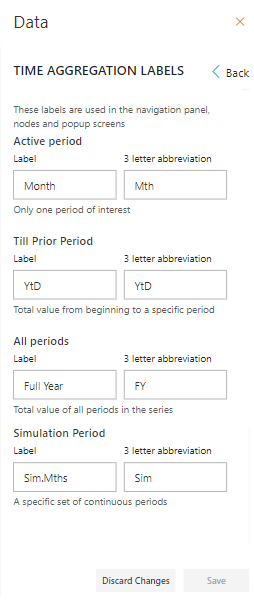
Data Label – Time Aggregation Labels
Based on the above configuration, you will be able to view the valQ screen as shown below.
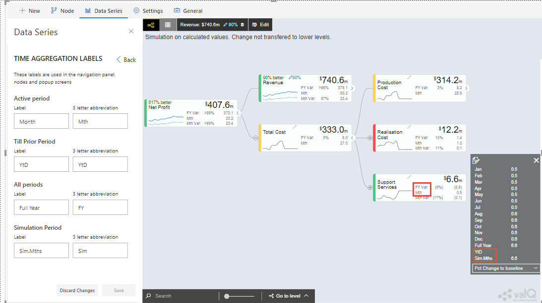
valQ screen with time aggregation labels
From the above Figure, you will be able to view the Time Aggregation Labels as highlighted in the valQ screen.
Data Sorting
Using the Data Sorting settings, you will be able to view and customize your Data Source. You will be able to select the Sort fields, sort the data with Ascending or Descending Order and select the Start With field with the required Month (see Figure below).
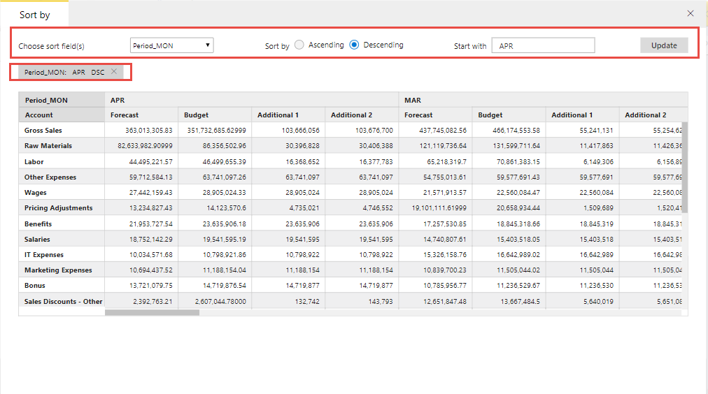
Data Sorting Settings
Additional Properties of Data Series Tab
Area |
Property |
Description |
|---|---|---|
Data Series Manager |
Periods |
Period(s) per data series: It indicates the number of values in the series. As an example, the series with Jan, Feb and Mar can be entered as 3 periods. |
Period Label(s): The Labels can be given as Jan, Feb, Mar (being separated by commas. |
||
Data Series |
By enabling this property, you will be able to include the Comparison Data Series. |
|
The Preview shows all the available Data Series (both Baseline and Comparison) and the Additional Series. |
||
Time Aggregation Labels |
These labels are used in the navigation panel, nodes and popup screens. |
|
Active period |
This property sets only one period of interest. A Label and a three letter abbreviation can be provided for this property. |
|
Till Prior Period |
This property sets Total value from beginning to a specific period. A Label and a three letter abbreviation can be provided for this property. |
|
All periods |
This property sets Total value of all periods in the series. A Label and a three letter abbreviation can be provided for this property. |
|
Simulation Period |
This property sets a specific set of continuous periods. A Label and a three letter abbreviation can be provided for this property. |
|
Data Sorting |
The data can be sorted using the below filters: 1. Choose Sort Field(s) from the data source 2. Sort By: Ascending/Descending 3. Start with entry from the data source |
Additional Properties of Data Series Tab
Settings Tab
Using the Settings Tab, you will be able to configure the settings for the Navigation Panel, Nodes, Canvas, Number Formatting, Conditional Formatting and Color Theme.
Nodes
This Node settings allows you to map the Nodes to queries in the ID, Text or ID + Text Formats. In the Node Mapping settings in valQ, the Data Mapping Format has 2 options as listed below: listed below (see Figure below).
Map based on ID or Text - For example, you can use this option if the field value exactly matches your Node’s unique ID or Text (e.g., Text - ‘Canada’)
Map based on ID-Text Pair - For example, you can use this option if your field has a key-text format (e.g., ‘CA:Canada’), and your Node’s ID corresponds to a key (e.g.,‘CA’).
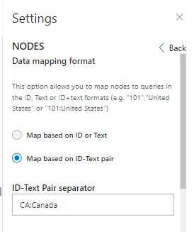
Data Mapping Format
For our example, we would explore the settings for Map based on ID-Text Pair. The data source which is assigned for the Node Mapping is shown below:
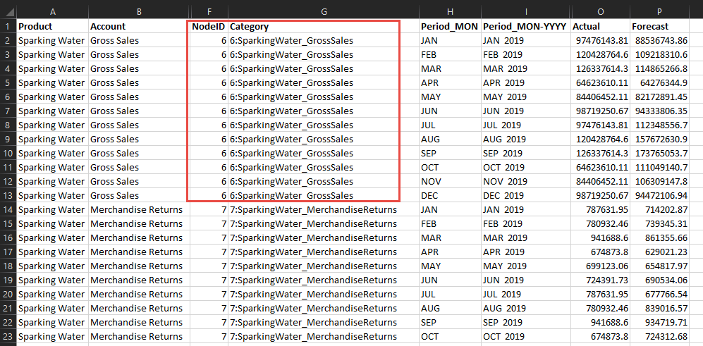
Excel Data Source with Node Mapping
From the above Figure, you will be able to view the Node ID as 6 and tab as 6:SparklingWater_GrossSales.
Based on the above configuration, you will be able to view the valQ screen as shown below.
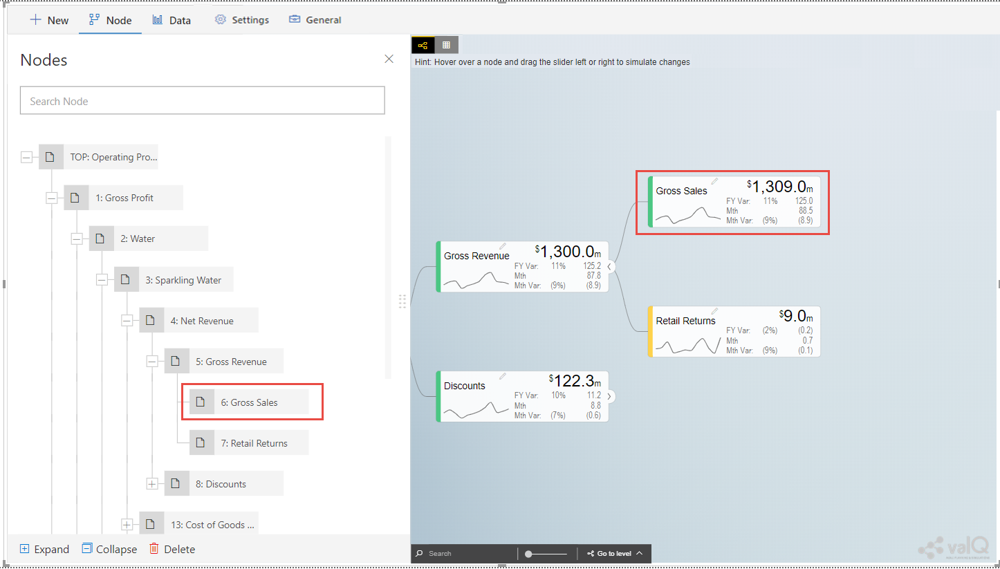
valQ screen with Node Mapping
From the above Figure, you will be able to observe that the key-text format here is 6:SparklingWater_GrossSales.
You will be also able to configure the Default Node Style with three different options namely Standard, Full and Minimal as shown in the below Figure.
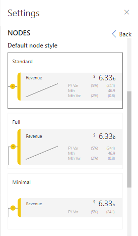
Default Node Style
You will be able to enable/disable the Node Elements like Variance, Trend Spark Line, Secondary Value/Variance and Descendant Node Count (see Figure below).
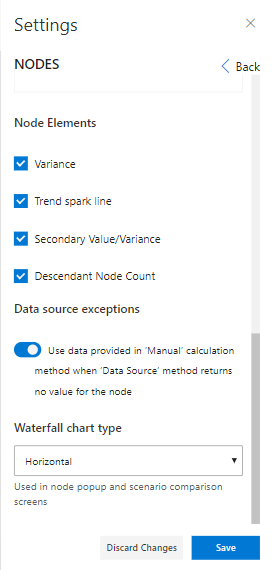
Node Settings
By enabling the option “Data Source Exception”, you can use the Data provided in “Manual” Calculation Method when the Data Source Method returns no value for the Node.
For our example, the Waterfall Chart Type is selected as “Horizontal”. Based on the above settings you will be able to view the valQ screen as shown below.
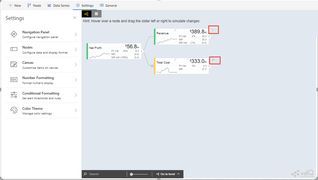
valQ screen with Node Settings
From the above Figure, you can observe that the Node Styles is set to “Standard” Type and the Node Elements like Variance, Trend Spark Line, Secondary Value/Variance and Descendant Node Count are displayed in the Node based on the configuration.
By clicking the Node, you will observe that the Waterfall chart type in the Pop up screen is rendered as Horizontal Chart Type based on our settings (see Figure below).
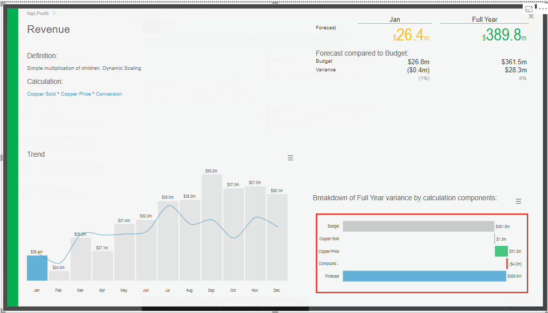
Pop up screen showing Horizontal Chart Type
As part of the New Release, when the Node Style is selected as “Standard”, you can view the Node Elements Variance, Trend Spark Line and Secondary Value/Variance being selected by default (see Figure below).
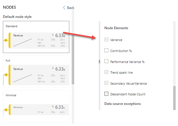
Node Elements for Standard Node Style
When the Node Style is being selected as “Minimal”, then you will be able to view only the Node element Variance being selected by default (see Figure below).
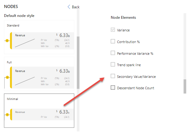
Node Element for Minimal Node Style
When the Node Style is being selected as “Full”, then you will be able to view all the Node elements without any default selection.
Contribution and Performance Variance Percentage
As part of the New Release, you will be now able to view the Contribution and Performance Variance Percentage being displayed at the Node Level. For our example, the Node Style has been selected as “Full” and the Node Elements: Variance, Contribution Percentage, Performance Variance Percentage, Trend Spark Line and Secondary Value/Variance have been selected (see Figure below).
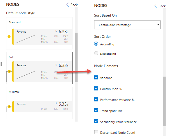
Node Style and Node Element Selection
For our example, the property Sort Based On is set to the option “Contribution Percentage” and the property Sort Order has been set to the option “Ascending” (see Figure above).
Based on the above settings, you will be able view the Nodes displaying the Contribution Percentage values in Ascending order (see Figure below).
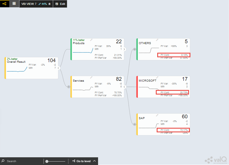
Node showing Contribution Percentage values in Ascending order
Similarly, you will be also able to view the Performance Variance Percentage values in the Ascending Order based on the configuration (see Figure below).
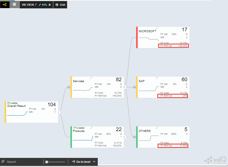
Node showing Performance Variance Percentage values in Ascending order
Canvas
In the Canvas settings, you will be able to configure the following properties:
You can set the property Default Visual to the option Tree or Table based on your choice. For our example, the property has been set to the option Table (see Figure below).
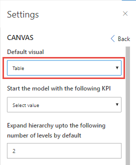
Canvas with Default Visual settings
Based on the above settings, you will be able to view the valQ screen with the Table appearance (see Figure below).
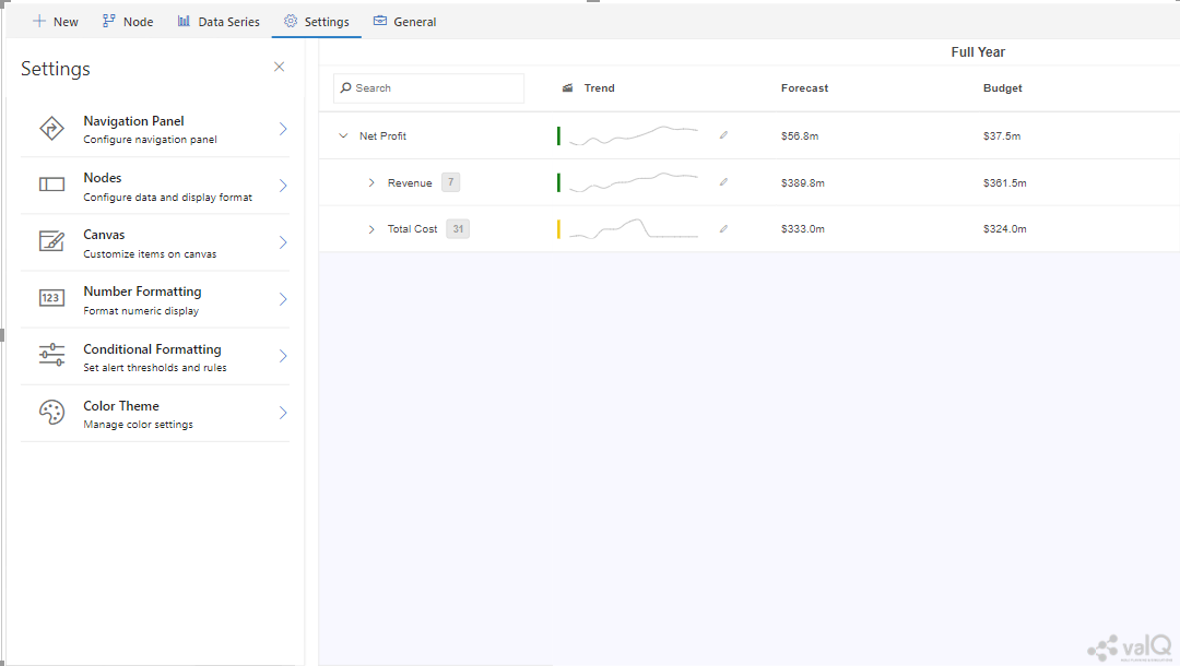
Canvas with default Table Visual
For our example, set the property “Start the model with the following KPI” to the option “9:Total Cost” (see Figure below).
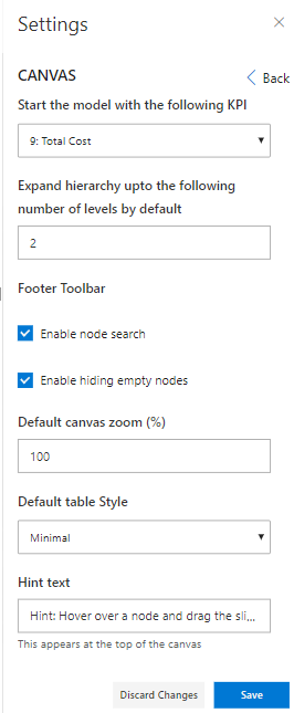
Canvas Settings
Set the property ” Expand hierarchy upto the following number of levels by default” to the value 2 (see Figure above).
In the area Footer Toolbar, enable the property Enable Node Search and enable the property Enable Hiding Empty Nodes.
Set the property Default Canvas Zoom (%) to the value 100.
Set the property Default Table Style to the option “Standard”. This settings for the Table can be visualized only when the property “Default Visual” is selected as “Table”.
Set the property Hint Text as “Hover a node and drag the slider left or right to simulate changes”.
Based on the above configuration, you will be able to view the valQ screen as shown below.
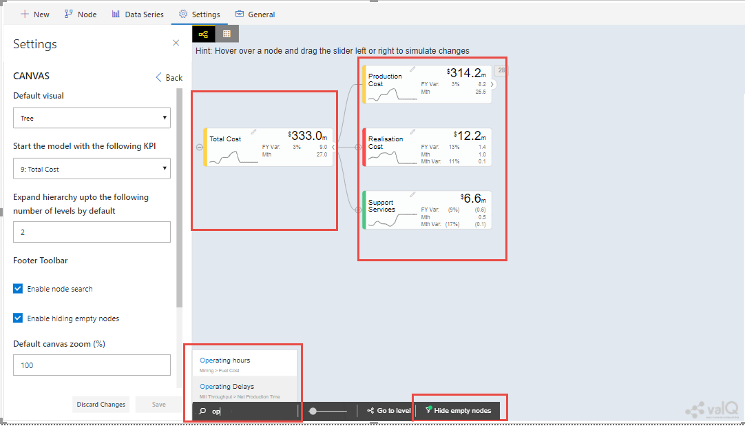
valQ screen with Canvas Settings
From the above Figure, you can observe that the first node starts with Total Cost. By default the Hierarchy of the Nodes are maintained upto 2 level. The Node level Search is enabled and you will not be able to visualize the Nodes with empty values based on the above configuration. You will be able to view the Canvas zoomed at 100% and the Hint is appearing with the Text as given in the settings.
Number Formatting
In the Number Formatting settings, you will be able to configure the following properties:
In the area Scale Suffix, set the property Thousands to “k” (see Figure below).
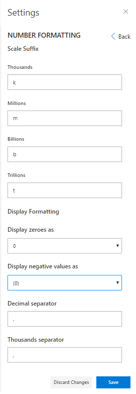
Number Formatting Settings
Set the property Millions to “m” (see Figure above).
Set the property Billions to “b”.
Set the property Trillions to “t”.
In the area Display Formatting, set the property Display zeroes as to the option “0”.
Set the property Display Negative values as to the option “(0)”.
Set the property Decimal Separator to “.”.
Set the property Thousands Separator to “,”.
Based on the above configuration, you will be able to view the valQ screen as shown below.
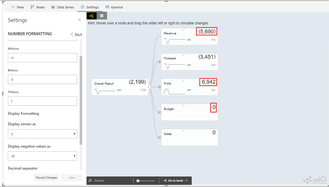
valQ screen with Number Formatting Settings
From the above Figure, you can observe that the zero value is displayed as “0” based on our configuration. The negative value has been represented as “(5,690)”. The thousand separator is represented as 6,942. The scale suffix settings will be displayed based on the data set that we use.
Conditional Formatting
In the Conditional Formatting settings, you will be able to set Alert Threshold and Rules. You will be able to configure the following properties for the Conditional Formatting.
You can enable/disable the property Enable Conditional Formatting as shown in the below.
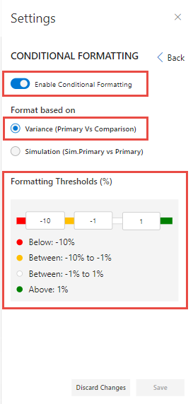
Conditional Formatting Settings
In the area Format based on, select the option Variance as shown in the above Figure. Now configure the Formatting Threshold values as highlighted in the above Figure. Based on the above settings, you will be able to view the Tree as shown below.
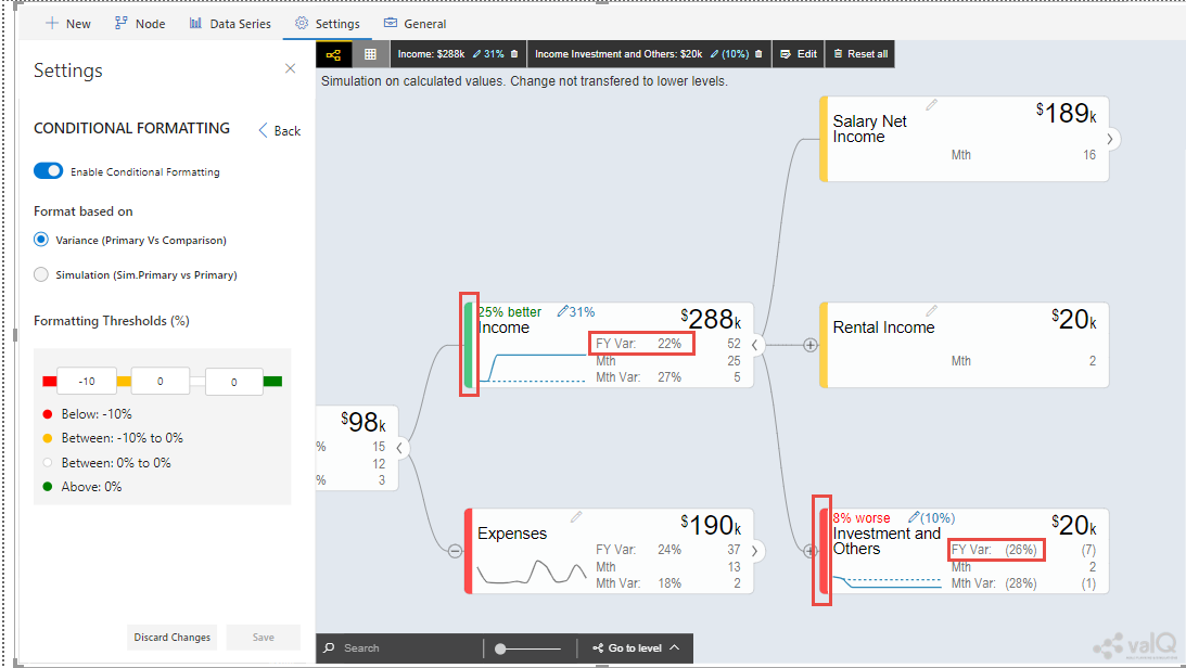
Conditional Formatting - Format based on Variance Percentage
After simulation, you can observe that the variance percentage value for the Node “Income” falls in the Threshold range 22% which is above 0% and based on that condition, the status bar for the Node is green color (see Figure above). Similarly the variance percentage value for the Node “Investment and Others” falls in the Threshold range (26%)* which is below -10% and based on that condition, the status bar for the Node is red color.
Now select the option Simulation as shown in the below Figure.
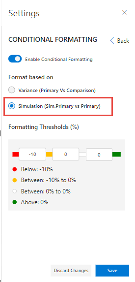
Conditional Formatting Settings
Based on the above settings, you will be able to view the Tree as shown below.
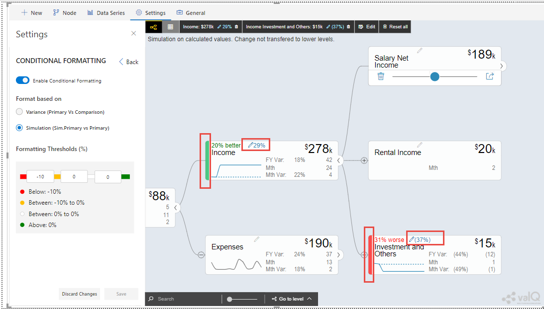
Conditional Formatting - Format based on Simulation Percentage
After simulation, you can observe that the simulation percentage value for the Node “Income” falls in the Threshold range 29% which is above 0% and based on that condition, the status bar for the Node is green color (see Figure above). Similarly the simulation percentage value for the Node “Investment and Others” falls in the Threshold range (37%)* which is below -10% and based on that condition, the status bar for the Node is red color.
Note: * indicates the negative values.
Color Theme
In the Color Theme settings, you will be able to configure the following properties:
You will be able to select the Light Theme or Dark Theme based on your choice (see Figure below). For our example, the Light Theme has been selected.
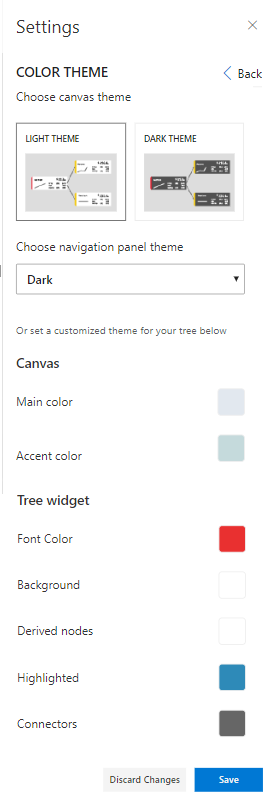
Color Theme Settings
Set the property “Choose Navigational Panel Theme” to the option Dark.
Set the Main and Accent color for the Canvas to the color as shown in the above Figure.
For the Tree Widget, set the colors for the properties Font Color, Background, Derived Nodes, Highlighted and Connectors to the required colors as shown in the above Figure.
You will be able to view the valQ screen having Light Theme color along with different colors selected for both the canvas as well as the tree widget based on the configured settings.
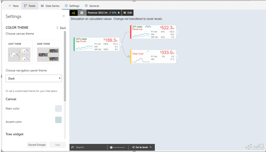
valQ screen with Color Theme Settings
Also you can observe that the Navigation Panel will be shown in Dark Theme based on the configuration.
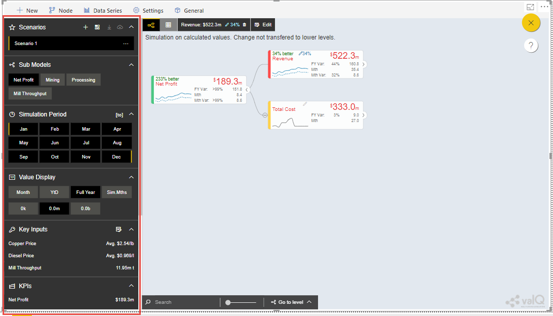
Navigation Panel with Dark Theme
For our example, you have configured the Highlighted color for the Node as Red Color (see Figure below).
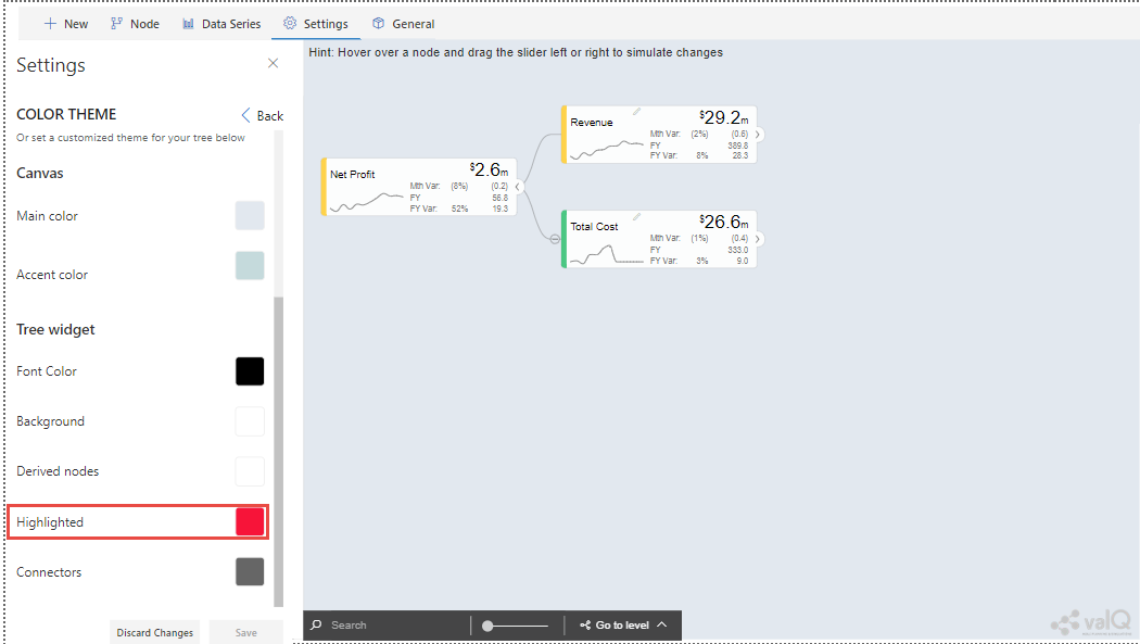
Highlighted Color Settings for Node
Based on the above configuration, you can observe that when you click and Node in the Navigation panel, the Node in the right pane will be highlighted based on the color selection. For our example, the Node is being highlighted in Red color.
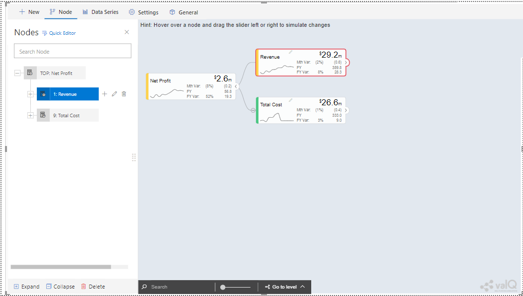
Node Highlighted color appearing in Red color
Additional Properties of Settings Tab
The Navigation Panel in the valQ screen will be configured based on the below listed properties.
Area |
Property |
Description |
|---|---|---|
Navigation Panel |
Enable Navigation Panel |
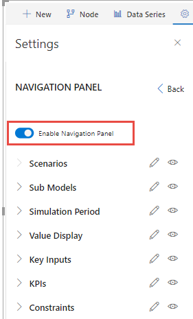
This property enables/disables the Navigation Panel in the valQ screen. |
Scenarios |
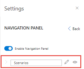
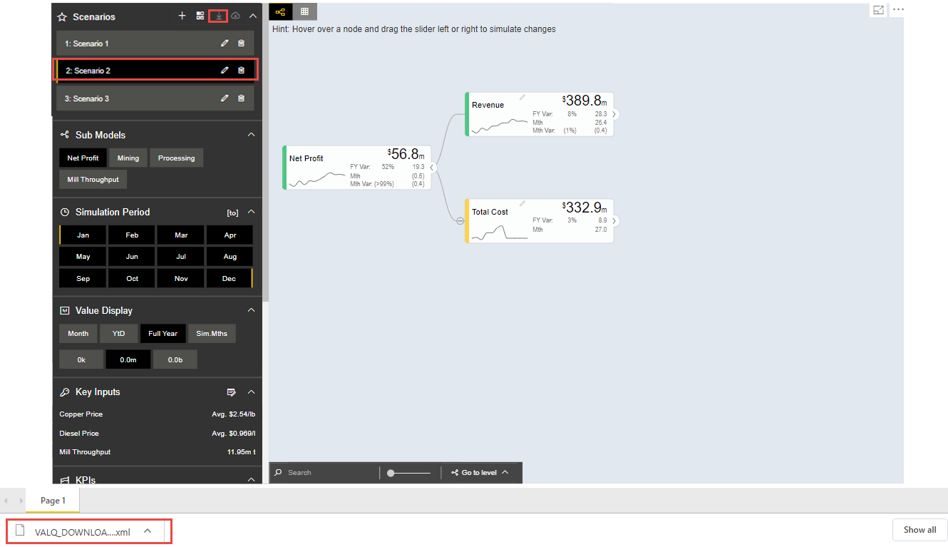
You can enable/disable the Visibility option for the Scenarios using the Eye icon and also set the Label for the Scenario using the Edit icon in the Navigation Panel Settings. |
|
Sub Models |
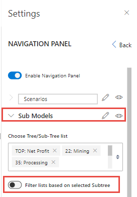
You can enable/disable the Visibility option for the Sub Models using the Eye icon and set the Label for the Sub Models using the Edit icon in the Navigation Panel Settings. You can select the Nodes from Tree/Sub-Tree List. You can also enable/disable the property for filtering the list based on the selected sub tree. |
|
Simulation Period |
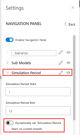
You can enable/disable the Visibility option for the Simulation Period using the Eye icon and also set the Label for the Simulation Period using the Edit icon in the Navigation Panel Settings. You can also set the Simulation Period Start and Simulation Period End. When you need to start the simulation from the current month, then you can select the “Start to current Month” option |
|
Value Display |
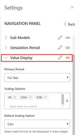
You can enable/disable the Visibility option for the Value Display using the Eye icon and set the Label for the Value Display using the Edit icon. You can select the Primary Period, Scaling options and Default Scaling options for the Value Display in the Navigation Panel. |
|
Key Inputs |
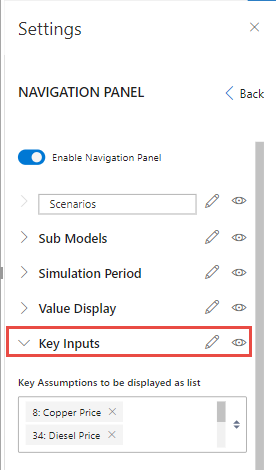
You can enable/disable the Visibility option for the Key Inputs using the Eye icon and set the Label for the Key Inputs using the Edit icon. Further you can also select the Key Assumptions to be displayed as List by selecting the required Nodes in the Navigation Panel |
|
KPIs |
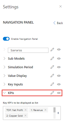
You can enable/disable the Visibility option for the KPIs using the Eye icon, set the Label for the KPIs using the Edit icon and further select the KPIs to be displayed as List by selecting the required Nodes in the Navigation Panel. |
|
Constraints |
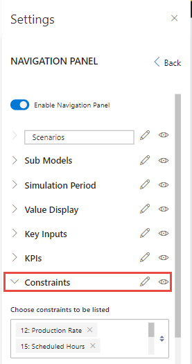
You can enable/disable the Visibility option for the Constraints using the Eye icon, set the Label for the Constraints using the Edit icon and further select the Constraints to be displayed as List by selecting the required Nodes in the Navigation Panel. You can also enable/disable the property for sorting the constraints based on utilization. |
|
Nodes |
Data Mapping Format |
This Node settings allows you to map the Nodes to queries in the ID, Text or ID + Text Formats. |
Map based on ID or Text |
For example, you can use this option if the field value exactly matches your Node’s unique ID or Text (e.g., Text - ‘Canada’) |
|
Map based on ID-Text Pair |
For example, you can use this option if your field has a key-text format (e.g., ‘CA:Canada’), and your Node’s ID corresponds to a key (e.g.,‘CA’). |
|
ID-Text Pair Separator |
You can provide the inputs for the ID-Text Pair format. |
|
Default Node Style |
This property is used to configure the style of the Node. The options are Standard, Full and Minimal. |
|
Node Elements |
This property is used to display the below listed elements in the Node:
|
|
Data Source Exceptions |
By enabling the option “Data Source Exception”, you can use the Data provided in “Manual” Calculation Method when the Data Source Method returns no value for the Node. |
|
Waterfall Chart Type |
The Pop up screen will be appearing with the type of the Waterfall Chart being selected. The options are Vertical and Horizontal. |
|
Number Formatting |
Scale Suffix |
This property sets the Thousands, Millions, Billions and Trillions Suffix for the scale. |
Display Formatting |
This property sets the Number Formatting for the following fields:
|
|
Canvas |
Default Visual |
This property sets the Default Visual as Tree or Table in the right pane. |
Start the Model with the following KPI |
The Model will get started based on the on the selection the specific Node from the list. |
|
Expand Hierarchy upto the following number of levels by default |
Using this property, you can expand the hierarchy upto the following number of levels by default. The minimum level is 2. |
|
Footer Toolbar – Enable Node Search |
This property enables/disables the Node Search in the canvas. |
|
Footer Toolbar – Enable hiding empty nodes |
This property hide Nodes that have no value mapped to it or have null value for all its periods. |
|
Default canvas zoom (%) |
This property sets the default zoom ratio for the canvas. |
|
Enable Conditional Formatting |
This property enables/disables the Conditional Formatting |
|
Default Table Style |
This property is used to configure the style of the Table. The options are Standard and Full. |
|
Hint |
This property sets the Hint which appears at the top of the canvas. |
|
Conditional Formatting |
Enable Conditional Formatting |
This property enables/disables the Conditional Formatting property. |
Format based on |
Each node will have a status bar property to indicate whether the trend of values is favorable and this property can be configured using these options Variance and Simulation. |
|
Formatting Thresholds (%) |
The Status bar color will be changed based on the percentage of deviant from initial value. The color ranges are given below:
|
|
Color Theme |
Choose Canvas Theme |
This Property sets the Theme for the Node. The options are Light Theme and Dark Theme. |
Choose Navigation Panel Theme |
This property sets the color for the Navigational Theme. The options are Dark and Light. |
|
Canvas |
This property sets the Main Color and Accent Color for the Canvas. |
|
Tree widget |
This property sets the Font color, Background color, Derived Nodes color, Highlighted Node color and Node Connectors color for the Tree Widget. |
Additional Properties of Settings Tab
General Tab
Using the General Tab, you will be able to configure the settings for the License Registration, Export and Writeback Functions.
License Registration
You will be able to enter the Subscription License Key in the License Key Text Box to unlock the Additional Features of the valQ (see Figure below).
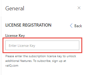
License Registration
Export
In the Export settings, you will be able to configure the export functionality. There is also an option to include the navigation settings panel in the Export File (see Figure below).
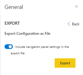
Export option
The saved file can be exported and this exported file can be used in the “Import from Excel” option in “Import an Advanced Model” tab (Refer Section: Import from an Export File).
Writeback
You will be able to export the Scenarios configured in the valQ through an URL by entering the Writeback URL in the Text Box (see Figure below).
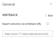
Export Scenarios via Writeback URL
The different simulations of planning results can be written back to the underlying systems using the URL exposed as part of the valQ. Using the URL, the user can do write-back scenario nodes to the underlying system.
For more details on Writeback Functionality, you can refer the link: https://valq.com/blogs/writeback-valq-data-using-microsoft-flow
Additional Properties of the General Tab
Area |
Property |
Description |
|---|---|---|
License Registration |
License Key |
You will be able to enter the Subscription License Key in the License Key Text Box to unlock the Additional Features of the valQ. |
Export |
Include navigation panel settings in the export file |
This property when activated exports the file along with Navigation Panel settings. |
Writeback |
Export Scenarios via Writeback URL |
You will be able to export the Scenarios configured in the valQ through an URL by entering the Writeback URL in the Text Box. |
Additional Properties of General Tab


